Closes#2797
I'm aware of https://github.com/go-gitea/gitea/pull/28163 exists, but since I had it laying around on my drive and collecting dust, I might as well open a PR for it if anyone wants the feature a bit sooner than waiting for upstream to release it or to be a forgejo "native" implementation.
This PR Contains:
- Support for the `workflow_dispatch` trigger
- Inputs: boolean, string, number, choice
Things still to be done:
- [x] API Endpoint `/api/v1/<org>/<repo>/actions/workflows/<workflow id>/dispatches`
- ~~Fixing some UI bugs I had no time figuring out, like why dropdown/choice inputs's menu's behave weirdly~~ Unrelated visual bug with dropdowns inside dropdowns
- [x] Fix bug where opening the branch selection submits the form
- [x] Limit on inputs to render/process
Things not in this PR:
- Inputs: environment (First need support for environments in forgejo)
Things needed to test this:
- A patch for https://code.forgejo.org/forgejo/runner to actually consider the inputs inside the workflow.
~~One possible patch can be seen here: https://code.forgejo.org/Mai-Lapyst/runner/src/branch/support-workflow-inputs~~
[PR](https://code.forgejo.org/forgejo/runner/pulls/199)

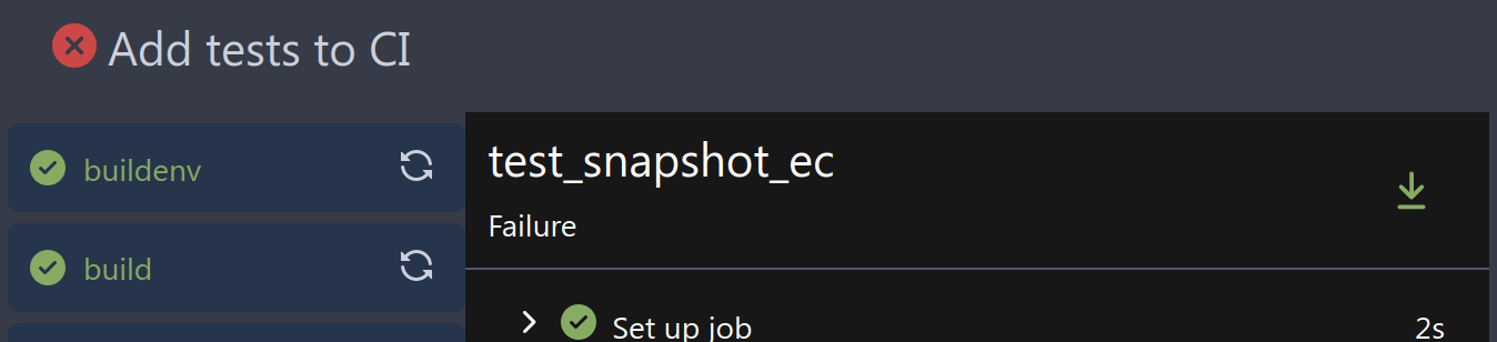
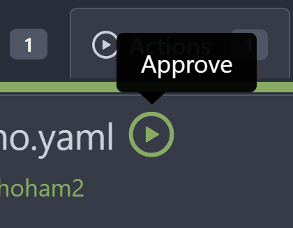
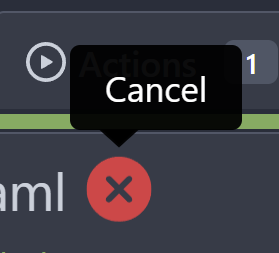
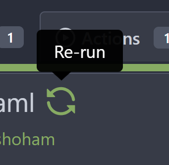
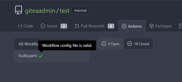
## Testing
- Checkout PR
- Setup new development runner with [this PR](https://code.forgejo.org/forgejo/runner/pulls/199)
- Create a repo with a workflow (see below)
- Go to the actions tab, select the workflow and see the notice as in the screenshot above
- Use the button + dropdown to run the workflow
- Try also running it via the api using the `` endpoint
- ...
- Profit!
<details>
<summary>Example workflow</summary>
```yaml
on:
workflow_dispatch:
inputs:
logLevel:
description: 'Log Level'
required: true
default: 'warning'
type: choice
options:
- info
- warning
- debug
tags:
description: 'Test scenario tags'
required: false
type: boolean
boolean_default_true:
description: 'Test scenario tags'
required: true
type: boolean
default: true
boolean_default_false:
description: 'Test scenario tags'
required: false
type: boolean
default: false
number1_default:
description: 'Number w. default'
default: '100'
type: number
number2:
description: 'Number w/o. default'
type: number
string1_default:
description: 'String w. default'
default: 'Hello world'
type: string
string2:
description: 'String w/o. default'
required: true
type: string
jobs:
test:
runs-on: docker
steps:
- uses: actions/checkout@v3
- run: whoami
- run: cat /etc/issue
- run: uname -a
- run: date
- run: echo ${{ inputs.logLevel }}
- run: echo ${{ inputs.tags }}
- env:
GITHUB_CONTEXT: ${{ toJson(github) }}
run: echo "$GITHUB_CONTEXT"
- run: echo "abc"
```
</details>
Reviewed-on: https://codeberg.org/forgejo/forgejo/pulls/3334
Reviewed-by: Earl Warren <earl-warren@noreply.codeberg.org>
Co-authored-by: Mai-Lapyst <mai-lapyst@noreply.codeberg.org>
Co-committed-by: Mai-Lapyst <mai-lapyst@noreply.codeberg.org>
The current format makes the text look somewhat like this:

```
testing.yml #15065 :Commit 103306f00c pushed by n0toose
```

This looks wrong. We will have to work on that list at a later point
in time anyways, as well as make the way that we separate information
in subheaders in lists like this one more consistent.

However, this should do for now.

This change should make each entry look like this instead:

```
testing.yml #15065 - Commit 103306f00c pushed by n0toose
```
Fix a number of text overflow issues in actions view and run list. Also
improve mobile view of run list.

Fixes: https://github.com/go-gitea/gitea/issues/30328

<img width="782" alt="Screenshot 2024-04-08 at 23 10 16"
src="3d9f9f88-3eab-44a0-8144-30c2b58b24cb">
<img width="935" alt="Screenshot 2024-04-08 at 23 17 46"
src="581d73ea-a31d-416b-be3a-47313b879b12">
<img width="1008" alt="Screenshot 2024-04-08 at 23 49 05"
src="c5d10565-f285-477f-8659-1caf94797647">
<img width="397" alt="Screenshot 2024-04-08 at 23 55 30"
src="368aaa75-1903-4058-9d75-d1fe91c564d6">

(cherry picked from commit b9f69b4a4d1d6b5b1f94852f6dfcae41b30658ff)
- Replace links from docs.gitea.com with forgejo.org/docs for those
where the relevant links are available on the Forgejo documentation.
- Resolves#2892
Fixes https://github.com/go-gitea/gitea/issues/30005. Regression from
https://github.com/go-gitea/gitea/pull/29945.

There was only once instance of `tw-content-center` before that PR, so I
just ran below command and reverted that one instance.

```sh
perl -p -i -e 's#tw-content-center#tw-items-center#g' web_src/js/**/* templates/**/* models/**/* tests/**/*
```

(cherry picked from commit 04f9ad056882fc3f21b247b16f84437adf0f36d8)

Conflicts:
	templates/repo/diff/conversation.tmpl
	templates/repo/header.tmpl
	templates/repo/issue/filter_list.tmpl
	templates/repo/issue/view_content/conversation.tmpl
	templates/repo/wiki/view.tmpl
	web_src/js/components/DashboardRepoList.vue
	re-ran the command after discarding the Gitea changes to
	ensure all Forgejo files are also covered
In HTML, `?key=val` already means "use the current link with new query parameters"

(cherry picked from commit 4c476fa41dc29dc24afda0925023ae3d0b9707cd)

Conflicts:
	templates/repo/issue/filter_list.tmpl
	templates/shared/issuelist.tmpl
	trivial context conflict because the lines in Forgejo have rel=nofollow
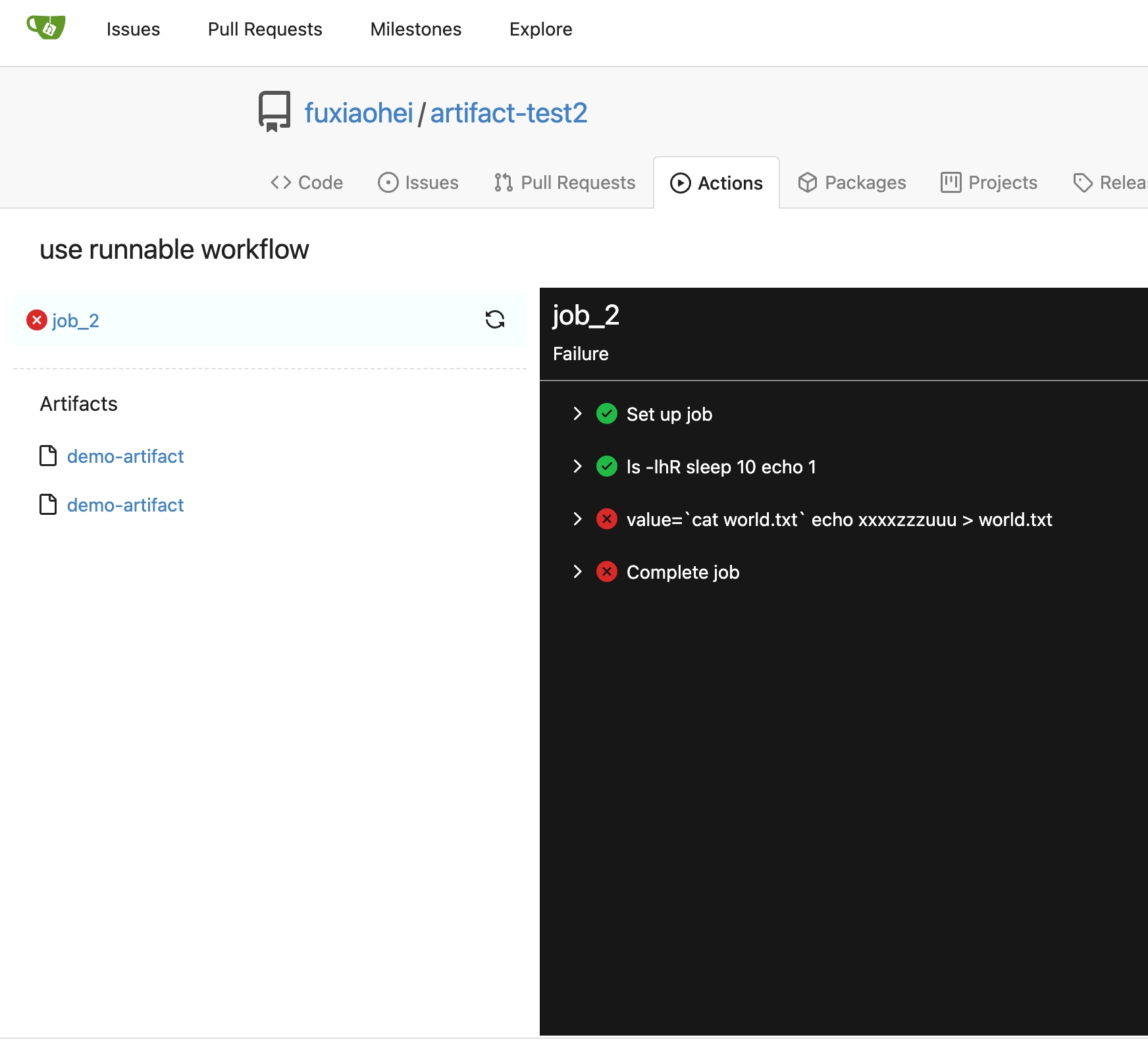
Add deletion link in runs view page.
Fix#26315

When click deletion button. It marks this artifact `need-delete`.
This artifact would be deleted when actions cleanup cron task.
Part of #27065

This PR touches functions used in templates. As templates are not static
typed, errors are harder to find, but I hope I catch it all. I think
some tests from other persons do not hurt.
Fix#26971
And the UI now will display it's scheduled but not triggered by a push.
<img width="954" alt="图片"
src="d211845c-457e-4c3e-af1f-a0d654d3f365">
1. There is already `gt-ac`, so no need to introduce `flex-item-center`
2. The `flex-item-baseline` and `.flex-item-icon svg { margin-top: 1px
}` seem to be a tricky patch, they don't resolve the root problem, and
still cause misalignment in some cases.
* The root problem is: the "icon" needs to align with the sibling
"title"
* So, make the "icon" and the "title" both have the same height
3. `flex-text-inline` could only be used if the element is really
"inline", otherwise its `vertical-align` would make the box size change.
In most cases, `flex-text-block` is good enough.

---------
Co-authored-by: silverwind <me@silverwind.io>
Co-authored-by: Giteabot <teabot@gitea.io>
Some small dashboard tweaks:

- Remove margin-bottom from divider so first item does not appear to
have un-equal margins
- Restore previous icon color
- Add slight margin-right to icon

Before:
<img width="783" alt="Screenshot 2023-08-31 at 00 10 28"
src="b75f70d7-8704-4afb-866d-fea0484c52d4">

After:
<img width="783" alt="Screenshot 2023-08-31 at 00 10 08"
src="50ed0c47-6f7c-449e-a054-13091369d43f">

---------

Co-authored-by: wxiaoguang <wxiaoguang@gmail.com>
As title, that's simmilar with github.


---------
Signed-off-by: a1012112796 <1012112796@qq.com>
Co-authored-by: silverwind <me@silverwind.io>
Co-authored-by: Jason Song <i@wolfogre.com>
This PR introduces a new UI element type for Gitea called `flex-item`.
It consists of a horizontal card with a leading, main and trailing part:

The idea behind it is that in Gitea UI, we have many cases where we use
this kind of layout, but it is achieved in many different ways:
- grid layout
- `.ui.list` with additional hacky flexbox
- `.ui.key.list` - looks to me like a style set originally created for
ssh/gpg key list, was used in many other places
- `.issue.list` - created for issue cards, used in many other places
- ...
This new style is based on `.issue.list`, specifically the refactoring
of it done in #25750.
In this PR, the new element is introduced and lots of templates are
being refactored to use that style. This allows to remove a lot of
page-specific css, makes many of the elements responsive or simply
provides a cleaner/better-looking way to present information.
A devtest section with the new style is also available.
<details>
<summary>Screenshots (left: before, right: after)</summary>


</details>
---------
Co-authored-by: Giteabot <teabot@gitea.io>
This PR does various modifications on the issue list shared template:
- restructure layout to achieve better responsiveness
- fix various style issues
- restructure styles (better result with less code :)
- remove numerous `gt-*` patches and other unneeded classes -> use
existing css classes
<details>
<summary>Before:</summary>


</details>
<details>
<summary>After:</summary>


</details>
---------
Co-authored-by: silverwind <me@silverwind.io>
Various small enhancements to the actions list. Before and after:

<img width="1264" alt="Screenshot 2023-06-30 at 00 11 40"
src="bb4162ee-cdcf-4a73-b05e-f9521562edbb">
<img width="1264" alt="Screenshot 2023-06-30 at 00 09 51"
src="52a70ea9-4bb3-406e-904b-0fdaafde9582">

---------

Co-authored-by: Giteabot <teabot@gitea.io>
Part of #25042

1. Added actor and status dropdowns first in case something is offtrack
and PR is too large.

2. Also added "No results matched." and "The workflow has no runs yet.",
and "No results matched." will show if there is no filter results and
there is no workflows (with [reference to github
action](https://github.com/go-gitea/gitea/actions/workflows/files-changed.yml?query=actor%3AGiteaBot))

Demo:


6e76292c-4c1f-450d-8b48-99944cfc920c


TODOs:

- [x] Get available status (same as those in `aggregateJobStatus`)
instead of getting from database
- [x] Use `JOIN` to get actors, actors order by name
- [x] Make self on top
Main changes:

- Moved the icon into `action-item-main`, and make it `position:
absolute` to allow add margin it to align with `issue-item-top-row`.
- Adjusted padding and color of texts.


# Before

<img width="721" alt="Screen Shot 2023-06-09 at 17 04 38"
src="3fc00e94-bcd4-4e06-b1d8-93be0576dbc3">


# After

<img width="1421" alt="Screen Shot 2023-06-09 at 18 32 47"
src="c2a0f9df-cac4-4197-9cbd-6c16dfef215b">

On hover:

<img width="1431" alt="Screen Shot 2023-06-09 at 18 32 54"
src="d0ab6fde-9722-4d76-831b-163fd6a1f560">
Part of #24728

- The timestamp shows local time and is parsed by `date.toLocaleString`;
- "show seconds" and "show timestamps" are mutually exclusive, and they
can be both hidden.


89531e54-37b7-4400-a6a0-bb3cc69eb6f5

Update for timestamp format:

<img width="306" alt="Screen Shot 2023-05-25 at 09 07 47"
src="2d99768d-d39c-4c9e-81a2-7bc7470399dd">

---------

Co-authored-by: silverwind <me@silverwind.io>
Co-authored-by: wxiaoguang <wxiaoguang@gmail.com>
Close#24625
Main changes:
1. For the left panel, show rerun icon only on hover, and add style when
the job is selected, and removed icon on the "rerun all" button and
modify the text on the button
cc437a17-d2e9-4f1b-a8cf-f56e53962767
2. Adjust fonts, and add on hover effects to the log lines. And add
loading effect when the job is done and the job step log is expanded for
the first time. (With reference to github)
2808d77d-f402-4fb0-8819-7aa0a018cf0c
3. Add `gt-ellipsis` to `step-summary-msg` and `job-brief-name`
<img width="898" alt="ellipsis"
src="e2fb7049-3125-4252-970d-15b0751febc7">
4. Fixed
https://github.com/go-gitea/gitea/issues/24625#issuecomment-1541380010
by adding explicit conditions to `ActionRunStatus.vue` and `status.tmpl`
5. Adjust some css styles
---------
Co-authored-by: silverwind <me@silverwind.io>
We should just show all runs. This removes the filtering altogether.
- Replaces https://github.com/go-gitea/gitea/pull/24553
# Before


# After

---------
Signed-off-by: Yarden Shoham <git@yardenshoham.com>
To clearly communicate the current state of the action


---------
Signed-off-by: Yarden Shoham <git@yardenshoham.com>
Partial regression of #24393, not only regression, but broken for long
time, 24393 didn't really improve it but used wrong `overflow: scroll`.

Actually, that "ui secondary filter menu labels" shouldn't be set as
scrollable (I missed that at that time), the problem is: if a "ui menu"
has "dropdown" items, then it should not be scrollable. Otherwise the
dropdown menu can't be shown correctly.

And there are more problems:

* The "issue-filters" shouldn't be used anywhere else (copying&pasting
problem again ....)
* There is also an "issue-actions" container, it should also be fixed.
* There are similar problems on the milestone page.
* The old comment in code: "grid column" doesn't work well.

The major changes of this PR are: use "flex: 1" instead of "ui grid
column".

After this PR, not 100% perfect but much better than before.
Close#24302
Part of #24229, Follows #24246
This PR focused on CSS style fine-tune, main changes:
1. Give `.ui.ui.ui.container` a width of `1280px` with a max-width of
`calc(100vw - 64px)`, so the main contents looks better on large
devices.
2. Share styles for table elements in all levels settings pages to fix
overflow of runners table on mobile and for consistency (The headers on
mobile can be further improved, but haven't found a proper way yet).
3. Use [stackable
grid](https://fomantic-ui.com/collections/grid.html#stackable) and
[device column width](https://fomantic-ui.com/examples/responsive.html)
for responsiveness for some pages (repo/org collaborators settings
pages, org teams related page)
4. Fixed#24302 by sharing label related CSS in reporg.css
5. Fine tune repo tags settings page
---------
Co-authored-by: wxiaoguang <wxiaoguang@gmail.com>
Follow:
* #23574
* Remove all ".tooltip[data-content=...]"

Major changes:

* Remove "tooltip" class, use "[data-tooltip-content=...]" instead of
".tooltip[data-content=...]"
* Remove legacy `data-position`, it's dead code since last Fomantic
Tooltip -> Tippy Tooltip refactoring
* Rename reaction attribute from `data-content` to
`data-reaction-content`
* Add comments for some `data-content`: `{{/* used by the form */}}`
* Remove empty "ui" class
* Use "text color" for SVG icons (a few)