silverwind
2e9ca0597d
Replace some gt- classes with tw- ( #29570 )
...
Replace 18 `gt-` prefixes with `tw-` with perl replacement. I manually
checked them all with `rg` afterwards.

(cherry picked from commit a2e90014ec20a1085449a66061389cfe0d12260f)

Conflicts:
	templates/repo/header.tmpl
	because some of the header moved to header_fork.tmpl
2024-03-11 23:36:57 +07:00
wxiaoguang
68099f2f00
Refactor some Str2html code ( #29397 )
...
This PR touches the most interesting part of the "template refactoring".

1. Unclear variable type. Especially for "web/feed/convert.go":
sometimes it uses text, sometimes it uses HTML.
2. Assign text content to "RenderedContent" field, for example: `
project.RenderedContent = project.Description` in web/org/projects.go
3. Assign rendered content to text field, for example: `r.Note =
rendered content` in web/repo/release.go
4. (possible) Incorrectly calling `{{Str2html
.PackageDescriptor.Metadata.ReleaseNotes}}` in
package/content/nuget.tmpl, I guess the name Str2html misleads
developers to use it to "render string to html", but it only sanitizes.
if ReleaseNotes really contains HTML, then this is not a problem.

(cherry picked from commit e71eb8930a5d0f60874b038c223498b41ad65592)

Conflicts:
	modules/templates/util_string.go
	trivial context conflict
2024-03-06 12:10:44 +08:00
Denys Konovalov
4d7c063f9e
Use full width for project boards ( #28225 )
...
Inspired by #28182
2023-11-27 17:43:52 +00:00
JakobDev
cf0df023be
More db.DefaultContext refactor ( #27265 )
...
Part of #27065

This PR touches functions used in templates. As templates are not static
typed, errors are harder to find, but I hope I catch it all. I think
some tests from other persons do not hurt.
2023-09-29 12:12:54 +00:00
delvh
1f89a45926
Fix incorrect change from #27231 ( #27275 )
2023-09-26 13:10:29 +00:00
wxiaoguang
93bd4351bf
Fix more "locale" usages ( #27259 )
2023-09-25 20:42:40 +08:00
delvh
7960ba7e2b
Always use ctx.Locale.Tr inside templates ( #27231 )
2023-09-25 08:56:50 +00:00
Denys Konovalov
2325fe777d
cleanup locale function usage ( #27227 )
2023-09-24 20:31:58 +00:00
wxiaoguang
1f026bcb7e
Fix dropdown icon position ( #27175 )
...
According to https://fomantic-ui.com/modules/dropdown.html and our
"devtest" page, many dropdown elements has incorrect "icon" position.

This PR fixes all of them. Fix #27173
2023-09-21 15:54:26 +00:00
silverwind
8099238618
Change green buttons to primary color ( #27099 )
...
I think it's better if the primary actions have primary color instead of
green which fits better into the overall single-color UI design. This PR
currently replaces every green button with primary:
<img width="141" alt="Screenshot 2023-09-16 at 14 07 59"
src="https://github.com/go-gitea/gitea/assets/115237/843c1e50-4fb2-4ec6-84ba-0efb9472dcbe ">
<img width="161" alt="Screenshot 2023-09-16 at 14 07 51"
src="https://github.com/go-gitea/gitea/assets/115237/9442195a-a3b2-4a42-b262-8377d6f5c0d1 ">
Modal actions now use uncolored/primary instead of previous green/red
colors. I also removed the box-shadow on all basic buttons:
<img width="259" alt="Screenshot 2023-09-16 at 14 16 39"
src="https://github.com/go-gitea/gitea/assets/115237/5beea529-127a-44b0-8d4c-afa7b034a490 ">
<img width="261" alt="Screenshot 2023-09-16 at 14 17 42"
src="https://github.com/go-gitea/gitea/assets/115237/4757f7b2-4d46-49bc-a797-38bb28437b88 ">
The change currently includes the "Merge PR" button, for which we might
want to make an exception to match the icon color there:
<img width="442" alt="Screenshot 2023-09-16 at 14 33 53"
src="https://github.com/go-gitea/gitea/assets/115237/993ac1a5-c94d-4895-b76c-0d872181a70b ">
2023-09-18 22:05:31 +00:00
wxiaoguang
4803766f7a
Refactor some CSS styles and simplify code ( #26771 )
...
Refactor some CSS styles and simplify code.

Some styles are not in use, remove them.
2023-08-28 22:14:51 +08:00
wxiaoguang
4fdb09de58
Fix incorrect "tabindex" attributes ( #26733 )
...
Fix #26731

Almost all "tabindex" in code are incorrect.

1. All "input/button" by default are focusable, so no need to use "tabindex=0"
2. All "div/span" by default are not focusable, so no need to use "tabindex=-1"
3. All "dropdown" are focusable by framework, so no need to use "tabindex"
4. Some tabindex values are incorrect (eg: `new_form.tmpl`), so remove them

Co-authored-by: Giteabot <teabot@gitea.io>
2023-08-26 10:44:00 +08:00
Denys Konovalov
7456573541
fix grab cursor on default column ( #26476 )
...
Fix https://github.com/go-gitea/gitea/pull/26448#issuecomment-1676194200

I accidentally set grab cursor for project columns instead of issue
cards, which actually turned out not to be a problem - with proper check
for the default column, which can't be moved.

---------

Co-authored-by: delvh <dev.lh@web.de>
Co-authored-by: Giteabot <teabot@gitea.io>
2023-08-14 09:15:16 +08:00
Denys Konovalov
ab78c39e41
Refactor project templates ( #26448 )
...
This PR refactors a bunch of projects-related code, mostly the
templates.
The following things were done:
- rename boards to columns in frontend code
- use the new `ctx.Locale.Tr` method
- cleanup template, remove useless newlines, classes, comments
- merge org-/user and repo level project template together
- move "new column" button into project toolbar
- move issue card (shared by projects and pinned issues) to shared
template, remove useless duplicated styles
- add search function to projects (to make the layout more similar to
milestones list where it is inherited from 😆 )
- maybe more changes I forgot I've done 😆
Closes #24893
After:


---------
Co-authored-by: silverwind <me@silverwind.io>
2023-08-12 10:30:28 +00:00
wxiaoguang
a370efc13f
Use template context function for avatar rendering ( #26385 )
...
Introduce `AvatarUtils`, no need to pass `$.Context` to every
sub-template, and simplify the template helper functions.
2023-08-10 11:19:39 +08:00
Earl Warren
6ed4626ed5
Merge templates/projects/list.tmpl and templates/repo/projects/list.tmpl together ( #26265 )
...
(cherry picked from commit 473862a1d599382ca022482e2e044025872d240b)

Refs: https://codeberg.org/forgejo/forgejo/pulls/1126

Co-authored-by: Louis Seubert <louis.seubert.ls@gmail.com>
Co-authored-by: Giteabot <teabot@gitea.io>
2023-08-01 16:54:54 +00:00
puni9869
8fc4774e5a
Fix margin on the new/edit project page. ( #25885 )
...
New/Edit Project page consistent layout. Fix margin on the new/edit
page.
Before:
<img width="1381" alt="image"
src="https://github.com/go-gitea/gitea/assets/80308335/303e128c-0bd0-4289-a395-ff077e33b1c8 ">
<img width="1392" alt="image"
src="https://github.com/go-gitea/gitea/assets/80308335/d11f7a42-ddf4-4c0a-a1b1-b8cefca9dfa1 ">
After
<img width="1390" alt="image"
src="https://github.com/go-gitea/gitea/assets/80308335/8ae1a979-9050-4d68-8f5d-9dfaa620c0e8 ">
<img width="1391" alt="image"
src="https://github.com/go-gitea/gitea/assets/80308335/24a62711-dc0a-4425-bf84-7c1896b9a005 ">
Co-authored-by: silverwind <me@silverwind.io>
2023-07-16 14:53:54 +00:00
wxiaoguang
cc00fd50f3
Clarify "text-align" CSS helpers, fix clone button padding ( #25763 )
...
Changes:
* Rename gt-tl/gt-tc/gt-tr to gt-text-left/gt-text-center/gt-text-right
* The gt-ab and gt-br-0 are removed because they are not needed anymore
* Fix the clone dropdown button padding by ":not(.icon)"
Before:
<details>

</details>
After:
<details>

</details>
Fixes #25758
Co-authored-by: Giteabot <teabot@gitea.io>
2023-07-08 11:53:56 +02:00
wxiaoguang
3780795b93
Reformat some templates ( #25756 )
...
Only: indent/dedent/newline
2023-07-07 18:06:49 +00:00
wxiaoguang
128d77a3a0
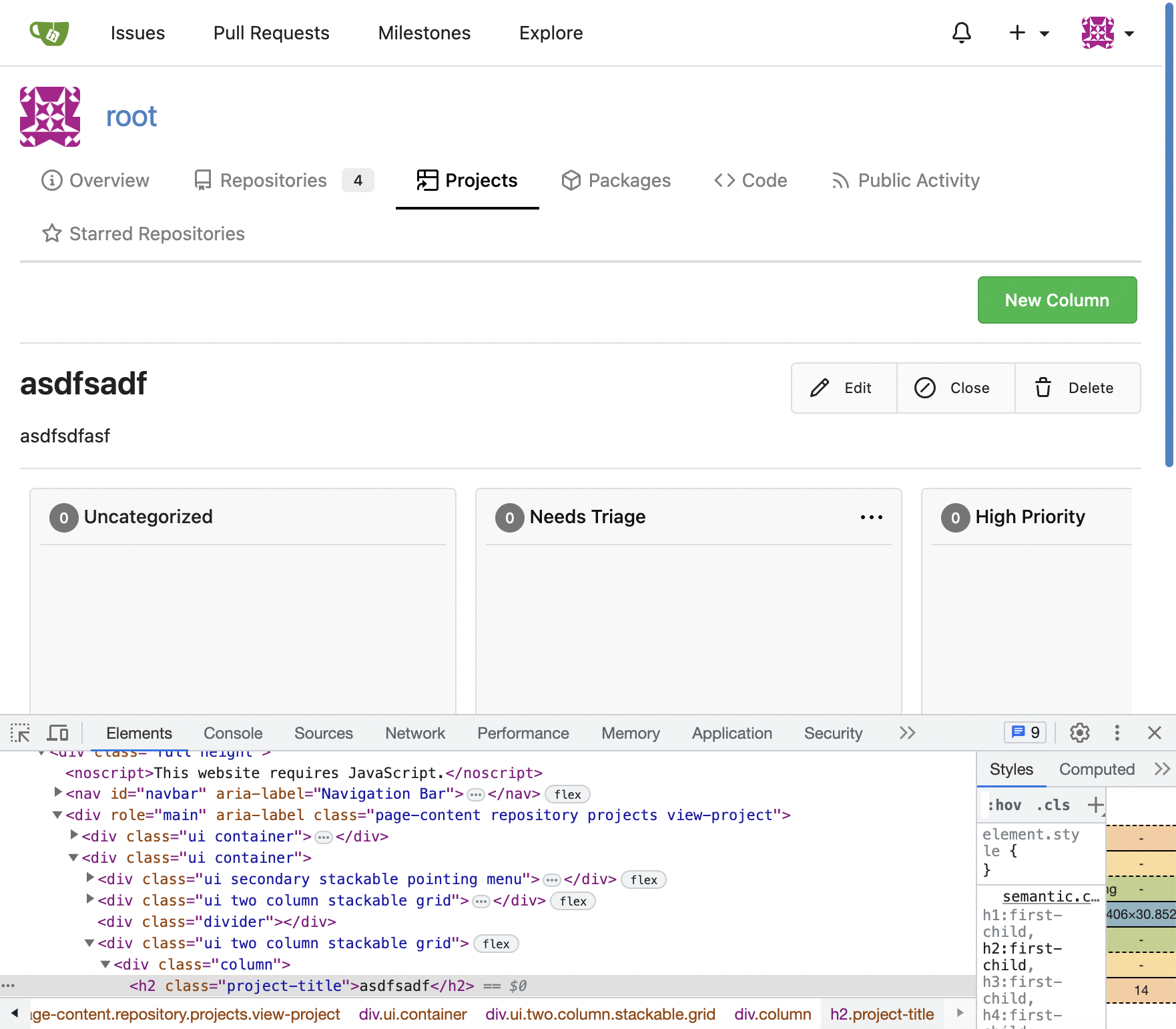
Following up fixes for "Fix inconsistent user profile layout across tabs" ( #25739 )
...
Follow
https://github.com/go-gitea/gitea/pull/25625#issuecomment-1621577816
1. Fix the incorrect "project view" layout
2. Fix the "follow/unfollow" link on "packages" and "projects" tab
Before:

After:
---------
Co-authored-by: Giteabot <teabot@gitea.io>
2023-07-07 17:27:12 +02:00
puni9869
2af30f715e
Fix inconsistent user profile layout across tabs ( #25625 )
...
Fix ::User Profile Page Project Tab Have Inconsistent Layout and Style
Added the big_avator for consistency in the all header_items tabs.
Fixes : #24871
> ### Description
> in the user profile page the `Packages` and `Projects` tab have small
icons for user but other tabs have bigger profile picture with user
info:
>
> ### Screenshots
> ### **For Packages And Projects:**
>

>
> ### **For Other Tabs:**
>

>
## Before

## After changes
Project View
<img width="1394" alt="image"
src="https://github.com/go-gitea/gitea/assets/80308335/95d181d7-8e61-496d-9899-7b825c91ad56 ">
Packages View
<img width="1378" alt="image"
src="https://github.com/go-gitea/gitea/assets/80308335/7f5fd60f-6b18-4fa8-8c56-7b0d45d1a610 ">
## Org view for projects page
<img width="1385" alt="image"
src="https://github.com/go-gitea/gitea/assets/80308335/6400dc89-a5ae-4f0a-831b-5b6efa020d89 ">
## Org view for packages page
<img width="1387" alt="image"
src="https://github.com/go-gitea/gitea/assets/80308335/4e1e9ffe-1e4b-4334-8657-de11b5fd31d0 ">
---------
Co-authored-by: wxiaoguang <wxiaoguang@gmail.com>
Co-authored-by: Giteabot <teabot@gitea.io>
Co-authored-by: silverwind <me@silverwind.io>
2023-07-06 18:59:24 +00:00
silverwind
64f2d70262
Replace fomantic divider module with our own ( #25539 )
...
Should look exactly like before for normal dividers. "Horizontal" ones
look better because they no longer use image backgrounds.
<img width="917" alt="Screenshot 2023-06-27 at 19 07 56"
src="https://github.com/go-gitea/gitea/assets/115237/d97d8dec-6859-44a8-85ba-e4549b4dd9df ">
<img width="914" alt="Screenshot 2023-06-27 at 19 05 58"
src="https://github.com/go-gitea/gitea/assets/115237/8bf98544-2d82-4ebf-ac68-d6dc237bd6b2 ">
<img width="1246" alt="Screenshot 2023-06-27 at 19 00 42"
src="https://github.com/go-gitea/gitea/assets/115237/36a6bb21-6029-4f53-8bee-535f55c66fed ">
<img width="344" alt="Screenshot 2023-06-27 at 18 58 15"
src="https://github.com/go-gitea/gitea/assets/115237/a9e70aee-8e6b-4ea1-9e93-19c9f96aec6e ">
<img width="823" alt="Screenshot 2023-06-27 at 18 56 22"
src="https://github.com/go-gitea/gitea/assets/115237/e7a497cd-f262-4683-8872-23c3c8cce32f ">
<img width="330" alt="Screenshot 2023-06-27 at 19 21 11"
src="https://github.com/go-gitea/gitea/assets/115237/42f24149-a655-4c7e-bd26-8ab52db6446b ">
2023-06-29 20:24:22 +08:00
Denys Konovalov
bb31f36415
Remove test string ( #25447 )
...
Remove test string on delete project button, I overlooked it in a
previous PR 😄
2023-06-22 10:29:57 -05:00
silverwind
656d3cc719
Various UI fixes ( #25264 )
...
Numerous small UI fixes:

- Fix double border in collaborator list
- Fix system notice table background
- Mute links in repo and org lists
- Downsize projects edit buttons
- Improve milestones and project list rendering
- Condense milestone list entry to a single line of "metas"
- Mute ".." button in repo files list
2023-06-21 21:59:49 -04:00
Denys Konovalov
9e74063498
Fix UI on mobile view ( #25315 )
...
Various fixes to pages or elements which were looking ugly on mobile.
<details>
<summary>Screenshots</summary>


</details>
Co-authored by @silverwind
---------
Co-authored-by: silverwind <me@silverwind.io>
2023-06-18 10:31:42 +00:00
delvh
bf27fc3596
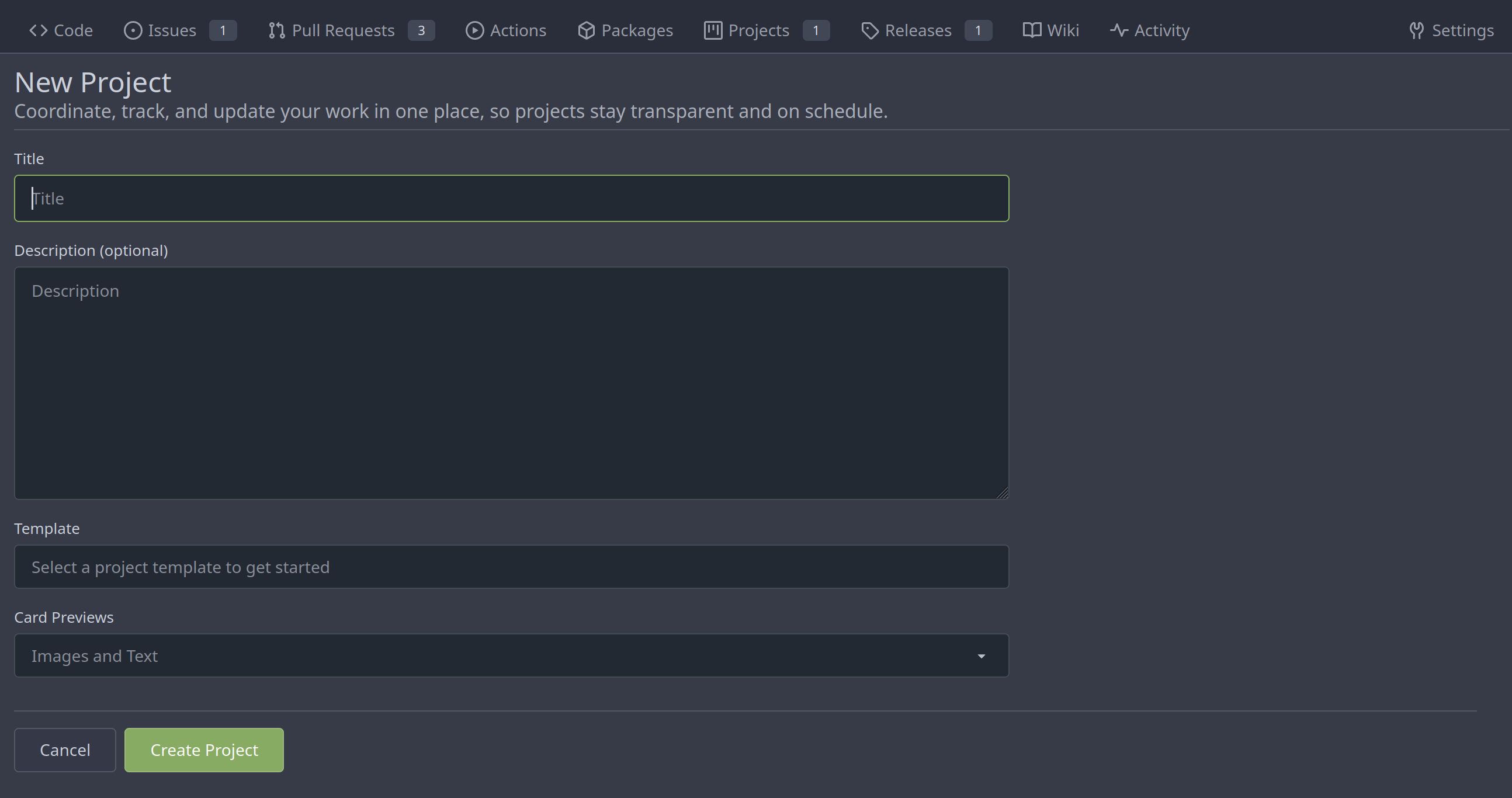
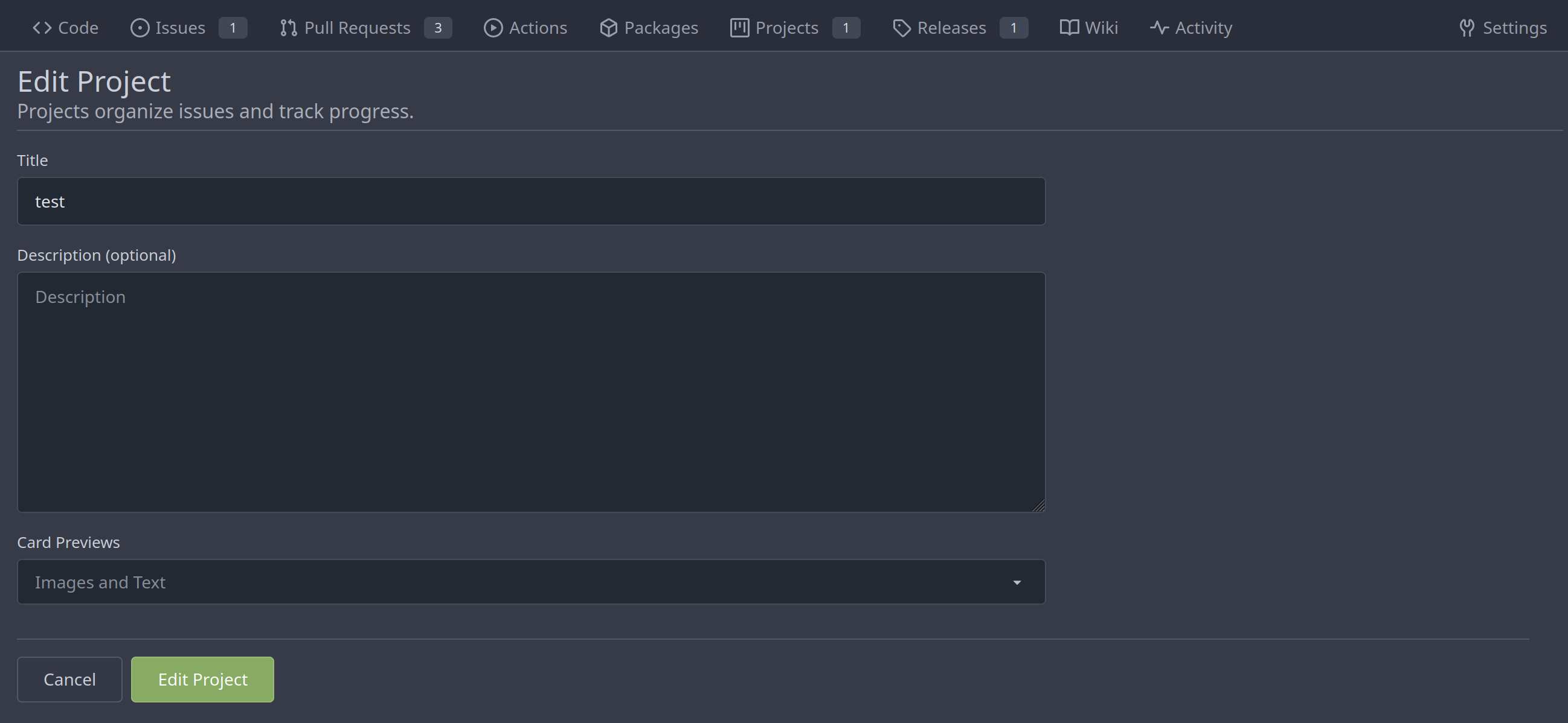
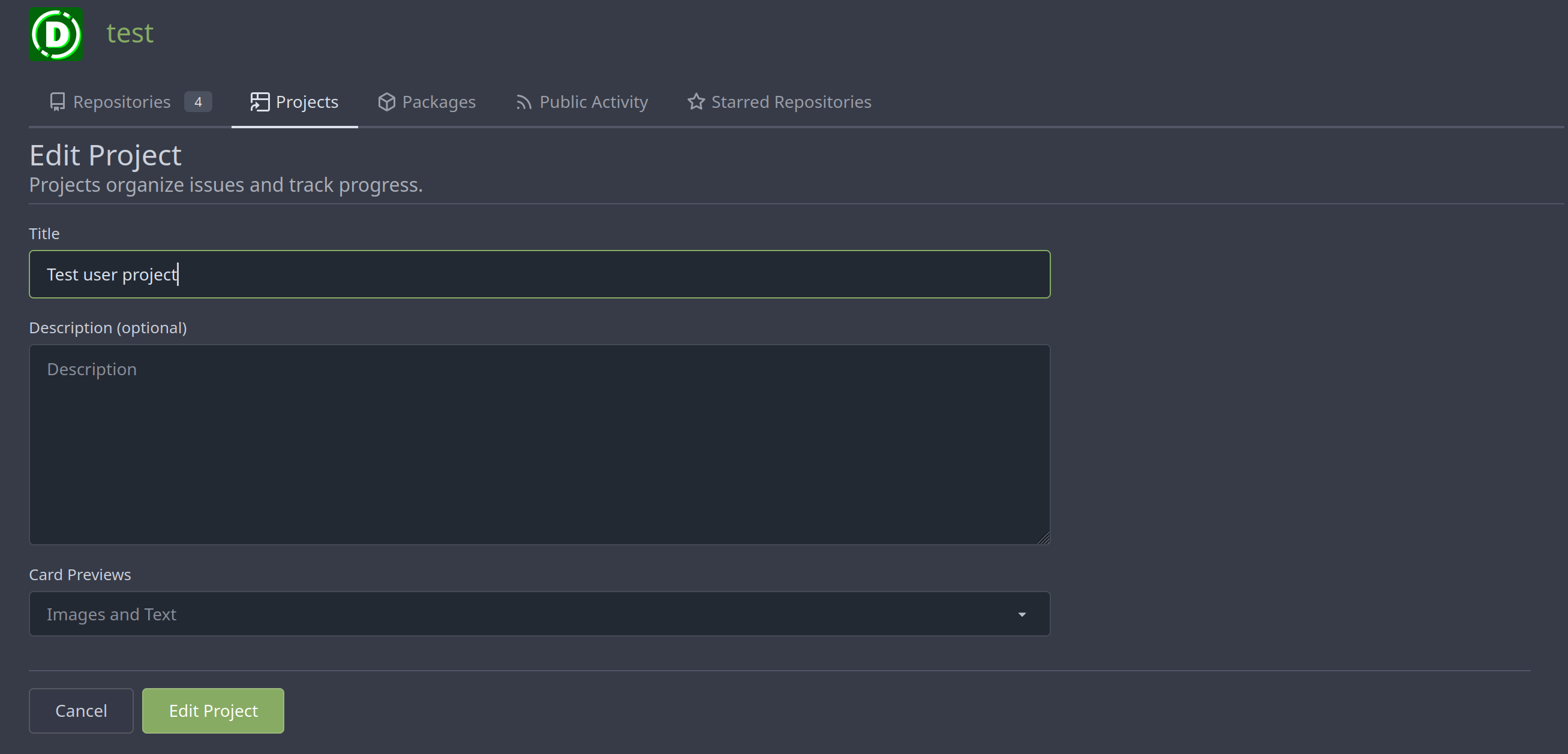
Merge new project templates into one ( #24985 )
...
Additionally simplify the `new project` template slightly.
Review hint: Disable whitespace changes.
<details><summary>Before</summary>
## New repo project

## Edit repo project

## New user/org project

## Edit user/org project

</details>
<details><summary>After</summary>
## New repo project
## Edit repo project
## New user/org project

## Edit user/org project
</details>
---------
Co-authored-by: Giteabot <teabot@gitea.io>
2023-05-31 08:50:18 +02:00
silverwind
79087bdb26
Use shared/issueicon template in projects ( #24922 )
...
We can reuse the recently created subtemplate here. I also checked the
whole templates for similar constructs, these appear to be the only one.

Co-authored-by: Giteabot <teabot@gitea.io>
2023-05-25 14:25:31 +02:00
yp05327
bc719f549e
Update pin and add pin-slash ( #24669 )
...
Continue #23531
Thanks for the update in https://github.com/primer/octicons/issues/940 ,
@CameronFoxly
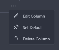
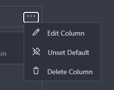
2023-05-12 14:38:59 +08:00
yp05327
2ee72d011f
Add permission check for moving issue action in project view page ( #24589 )
...
Fix #22954
Only users who have write permission can move issues in the project view page.
2023-05-09 00:50:16 -04:00
silverwind
4a722c9a45
Make Issue/PR/projects more compact, misc CSS tweaks ( #24459 )
...
- Remove various horizontal dividers on repo pages that didn't provide
visual benefit
- Remove label/milestone pills on single issue/pr page
- Remove issue-related pill buttons on projects page
- Increase contrast of color-secondary on arc-green
- Improve notifications icon, make circle bigger
- Remove some inline styles
- Fix focus in issue/pr title edit and select all text on button click
### Issue and PR before and after
<img width="1249" alt="Screenshot 2023-05-01 at 11 44 22"
src="https://user-images.githubusercontent.com/115237/235436662-a708288e-84fb-4b2e-a5a2-3a1c17d28f6c.png ">
<img width="1248" alt="Screenshot 2023-05-01 at 11 58 51"
src="https://user-images.githubusercontent.com/115237/235437992-f863e483-f3cc-4cc1-8204-fd223647a0c9.png ">
### Projects before and after
<img width="1255" alt="Screenshot 2023-05-01 at 11 41 02"
src="https://user-images.githubusercontent.com/115237/235436433-0deb85d6-4e7d-4e74-847f-254cc70a0cf9.png ">
<img width="1267" alt="Screenshot 2023-05-01 at 11 40 03"
src="https://user-images.githubusercontent.com/115237/235436431-715b13cb-f78c-4d86-b27a-9229f9738c5b.png ">
### Releases before and after
<img width="1243" alt="Screenshot 2023-05-01 at 11 41 12"
src="https://user-images.githubusercontent.com/115237/235436457-b655ee6f-03b8-4595-8d8c-b15ea469e988.png ">
<img width="1240" alt="Screenshot 2023-05-01 at 11 40 10"
src="https://user-images.githubusercontent.com/115237/235436456-05a2a0dd-7cbb-4f26-b0d3-4f667df4bb95.png ">
### Misc
<img width="58" alt="Screenshot 2023-05-01 at 10 49 13"
src="https://user-images.githubusercontent.com/115237/235432494-936ce995-6e22-47bc-ab2d-c9e93d31987d.png ">
<img width="57" alt="Screenshot 2023-05-01 at 18 57 08"
src="https://user-images.githubusercontent.com/115237/235492430-1d32cfe0-0f2c-467c-b2fa-925b27e30e0e.png ">
Issue title edit and wrap:
<img width="1238" alt="Screenshot 2023-05-01 at 12 34 40"
src="https://user-images.githubusercontent.com/115237/235441407-d5067a57-e586-4865-a652-282e5944abb4.png ">
<img width="1232" alt="Screenshot 2023-05-01 at 12 06 24"
src="https://user-images.githubusercontent.com/115237/235438710-1a543dda-220f-4d87-8f93-f1710c0695f0.png ">
---------
Co-authored-by: wxiaoguang <wxiaoguang@gmail.com>
2023-05-03 17:58:59 -04:00
silverwind
8f4dafcd4e
Rework header bar on issue, pull requests and milestone ( #24420 )
...
- Make search bar dynamic full width via flexbox
- Make all buttons `small` so font size is the same for all elements in
the header
- Remove primary color from search field, add SVG icon like on Code tab
- Fix button vertical padding being enlarged by SVG icons
[View diff without
whitespace](https://github.com/go-gitea/gitea/pull/24420/files?diff=unified&w=1 )
<img width="1226" alt="Screenshot 2023-04-29 at 11 58 53"
src="https://user-images.githubusercontent.com/115237/235296851-74848267-664f-4c1f-b94c-a1b94196ff75.png ">
<img width="1219" alt="Screenshot 2023-04-29 at 11 59 39"
src="https://user-images.githubusercontent.com/115237/235296852-bcfde5ed-8658-43c2-b7e5-3ad84611e76f.png ">
Mobile:
<img width="437" alt="Screenshot 2023-04-29 at 11 59 52"
src="https://user-images.githubusercontent.com/115237/235296860-99263373-7b27-4540-868c-a93e70f281ca.png ">
<img width="433" alt="Screenshot 2023-04-29 at 12 00 00"
src="https://user-images.githubusercontent.com/115237/235296862-6cf64317-a864-405a-a00f-b5ab620349f5.png ">
2023-04-29 23:33:25 -04:00
wxiaoguang
75c62054a6
Improve some modal action buttons ( #24289 )
...
Follow #24097 and #24285
And add a devtest page for modal action button testing.
http://localhost:3000/devtest/fomantic-modal
Now the `modal_actions_confirm.tmpl` could support: green / blue /
yellow positive buttons, the negative button is "secondary".
ps: this PR is only a small improvement, there are still a lot of
buttons not having proper colors. In the future these buttons could be
improved by this approach.
These buttons could also be improved according to the conclusion of
#24285 in the future.

And add GitHub-like single danger button (context:
https://github.com/go-gitea/gitea/issues/24285#issuecomment-1519100312 )

---------
Co-authored-by: silverwind <me@silverwind.io>
2023-04-24 07:08:59 -04:00
Hester Gong
476a043a5f
Refactor delete_modal_actions template and use it for project column related actions ( #24097 )
...
Co-Author: @wxiaoguang
This PR is to fix
https://github.com/go-gitea/gitea/issues/23318#issuecomment-1506275446 .
The way to fix this in this PR is to use `delete_modal_actions.tmpl`
here both to fix this issue and keep ui consistency (as suggested by
[TODO
here](4299c3b7db/templates/projects/view.tmpl (L161)https://user-images.githubusercontent.com/17645053/233825650-76307e65-9255-44bb-80e8-7062f58ead1b.png ">
<img width="786" alt="Screen Shot 2023-04-23 at 15 17 21"
src="https://user-images.githubusercontent.com/17645053/233825652-4dc6f7d1-a180-49fb-a468-d60950eaee0d.png ">
Test for functionalities:
https://user-images.githubusercontent.com/17645053/233826857-76376fda-022c-42d0-b0f3-339c17ca4e59.mov
---------
Co-authored-by: wxiaoguang <wxiaoguang@gmail.com>
2023-04-23 17:24:19 +08:00
yp05327
f30cc9faa9
Add unset default project column ( #23531 )
...
Close: https://github.com/go-gitea/gitea/issues/23401
2023-04-19 10:28:28 -04:00
wxiaoguang
7681d582cd
Refactor locale number ( #24134 )
...
Before, the `GiteaLocaleNumber.js` was just written as a a drop-in
replacement for old `js-pretty-number`.
Actually, we can use Golang's `text` package to format.
This PR partially completes the TODOs in `GiteaLocaleNumber.js`:
> if we have complete backend locale support (eg: Golang "x/text"
package), we can drop this component.
> tooltip: only 2 usages of this, we can replace it with Golang's
"x/text/number" package in the future.
This PR also helps #24131
Screenshots:
<details>


</details>
2023-04-17 11:37:23 +08:00
Hester Gong
6a4be2cb6a
Add cardtype to org/user level project on creation, edit and view ( #24043 )
...
Part of #23318
The way to fix the missing cardtype for user/org level projects in this
PR is to port the cardtype related part from #22112 to org/user level
projects' template and router functions.
Before:
<img width="1135" alt="截屏2023-04-11 13 55 49"
src="https://user-images.githubusercontent.com/17645053/231069068-ba897129-ae90-4aa0-9b0f-468bf5c65375.png ">
<img width="1131" alt="截屏2023-04-11 13 55 59"
src="https://user-images.githubusercontent.com/17645053/231069084-279f6681-5a10-42da-b5a8-2b0ba47c7078.png ">
After:
Create
<img width="835" alt="截屏2023-04-11 13 27 16"
src="https://user-images.githubusercontent.com/17645053/231064445-0d6e12bd-5725-48db-a102-80e7472757c2.png ">
Edit
<img width="852" alt="截屏2023-04-11 13 27 05"
src="https://user-images.githubusercontent.com/17645053/231064503-c70525cd-1038-43ec-8d93-8b8d95d183d4.png ">
View
<img width="1329" alt="截屏2023-04-11 13 26 56"
src="https://user-images.githubusercontent.com/17645053/231064529-26023c85-698b-4b2e-af02-45f9820c77ec.png ">
Co-authored-by: Giteabot <teabot@gitea.io>
2023-04-11 14:28:40 -04:00
wxiaoguang
25faee3c5f
Fix date display bug ( #24047 )
...
Follow
https://github.com/go-gitea/gitea/pull/23988#pullrequestreview-1377696819
Many template helper functions are not good enough and cause various
problems, that's why I am cleaning them.
## Before


## After

2023-04-11 17:48:13 +08:00
wxiaoguang
19de52e0f4
Introduce GiteaLocaleNumber custom element to handle number localization on pages. ( #23861 )
...
Follow #21429 & #22861
Use `<gitea-locale-number>` instead of backend `PrettyNumber`. All old
`PrettyNumber` related functions are removed. A lot of code could be
simplified.
And some functions haven't been used for long time (dead code), so they
are also removed by the way (eg: `SplitStringAtRuneN`, `Dedent`)
This PR only tries to improve the `PrettyNumber` rendering problem, it
doesn't touch the "plural" problem.
Screenshot:
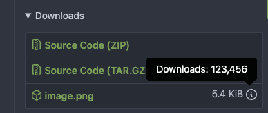

2023-04-03 12:58:09 -04:00
Zettat123
e6e602fd8d
Fix project card preview select and template select ( #23684 )
...
Now user cannot set Card Previews when creating a new project.

Before:

https://user-images.githubusercontent.com/15528715/227488883-29bbd636-8b98-45b3-b2f8-de5206b045dc.mp4

After:

https://user-images.githubusercontent.com/15528715/227488976-3447f252-805a-4f18-ae0e-1cddd921dcc3.mp4
2023-03-27 13:15:41 +08:00
wxiaoguang
8d5fbeb7a2
Use data-tooltip-content for tippy tooltip ( #23649 )
...
Follow:
* #23574
* Remove all ".tooltip[data-content=...]"

Major changes:

* Remove "tooltip" class, use "[data-tooltip-content=...]" instead of
".tooltip[data-content=...]"
* Remove legacy `data-position`, it's dead code since last Fomantic
Tooltip -> Tippy Tooltip refactoring
* Rename reaction attribute from `data-content` to
`data-reaction-content`
* Add comments for some `data-content`: `{{/* used by the form */}}`
* Remove empty "ui" class
* Use "text color" for SVG icons (a few)
2023-03-24 18:35:38 +08:00
sillyguodong
d02e83a2c3
Fix cancel button in the page of project edit not work ( #23655 )
...
Before, in project edit page, the cancel button is not work.
https://user-images.githubusercontent.com/33891828/227182731-6478e29f-0e52-48c4-beb0-6a7d1dda6a1d.mov
1. The wrong classname `cancel` was added to the `<a>` tag. That
classname caused the default click event of `<a>` tag to be cancelled.
Because we have the following settings in the global. So I remove the
classname `cancel`.
9be90a5875/web_src/js/features/common-global.js (L325-L327)https://user-images.githubusercontent.com/33891828/227187326-c653c6d6-9715-440f-a732-ba0a6f012c81.mov
2023-03-24 16:37:56 +08:00
wxiaoguang
389e83f7eb
Improve <SvgIcon> to make it output svg node and optimize performance ( #23570 )
...
Before, the Vue `<SvgIcon>` always outputs DOM nodes like:
```html
<span class="outer-class">
<svg class="class-name-defined" ...></svg>
</span>
```
The `span` is redundant and I guess such layout and the inconsistent
`class/class-name` attributes would cause bugs sooner or later.
This PR makes the `<SvgIcon>` clear, and it's faster than before,
because it doesn't need to parse the whole SVG string.
Before:
<details>

</details>
After:

---------
Co-authored-by: silverwind <me@silverwind.io>
2023-03-23 11:24:16 +08:00
yp05327
1a4efa0ee9
Use project.IconName instead of repeated unreadable if-else chains ( #23538 )
...
The project type will be changed in
https://github.com/go-gitea/gitea/pull/23353 , so the old fix
https://github.com/go-gitea/gitea/pull/23325 will not work as well.
And I also found that there were some problems in the old fix....
---------
Co-authored-by: Lauris BH <lauris@nix.lv>
2023-03-19 14:44:48 +02:00
delvh
81fe5d6185
Convert <div class="button"> to <button class="button"> ( #23337 )
...
This improves a lot of accessibility shortcomings.
Every possible instance of `<div class="button">` matching the command
`ag '<[^ab].*?class=.*?[" ]button[ "]' templates/ | grep -v 'dropdown'`
has been converted when possible.
divs with the `dropdown` class and their children were omitted as
1. more analysis must be conducted whether the dropdowns still work as
intended when they are a `button` instead of a `div`.
2. most dropdowns have `div`s as children. The HTML standard disallows
`div`s inside `button`s.
3. When a dropdown child that's part of the displayed text content is
converted to a `button`, the dropdown can be focused twice
Further changes include that all "gitea-managed" buttons with JS code
received an `e.preventDefault()` so that they don't accidentally submit
an underlying form, which would execute instead of cancel the action.
Lastly, some minor issues were fixed as well during the refactoring.
## Future improvements
As mentioned in
https://github.com/go-gitea/gitea/pull/23337#discussion_r1127277391 ,
`<a>`s without `href` attribute are not focusable.
They should later on be converted to `<button>`s.
---------
Co-authored-by: wxiaoguang <wxiaoguang@gmail.com>
Co-authored-by: silverwind <me@silverwind.io>
Co-authored-by: techknowlogick <techknowlogick@gitea.io>
Co-authored-by: Lunny Xiao <xiaolunwen@gmail.com>
2023-03-14 11:34:09 +08:00
yp05327
a04eeb2a54
Show edit/close/delete button on organization wide repositories ( #23388 )
...
A part of https://github.com/go-gitea/gitea/pull/22865
2023-03-12 14:36:47 +01:00
yp05327
e72290fd9a
Sync the class change of Edit Column Button to JS code ( #23400 )
...
In #22767 , we changed the class of `Edit Column` button from `red` to
`primary`
But `red` is used to find this button in js.....
---------
Co-authored-by: techknowlogick <techknowlogick@gitea.io>
Co-authored-by: zeripath <art27@cantab.net>
2023-03-12 19:09:20 +08:00
yp05327
e52ac62d8e
Redirect to project again after editing it ( #23326 )
...
A part of https://github.com/go-gitea/gitea/pull/22865

We have edit buttons in projects list page and project view page.
But after user edit a project, it will always redirect to the projects
list page.
2023-03-09 08:38:29 -06:00
delvh
608a3eeb59
Pass context to avatar for projects view ( #23359 )
...
Previously, a 500 response was returned when
- an issue had assignees
- the issue was assigned to a project
- you tried to view this project

Co-authored-by: techknowlogick <techknowlogick@gitea.io>
2023-03-07 18:17:35 -05:00
yp05327
3f547c7afb
Fix incorrect project links and use symlink icon for org-wide projects ( #23325 )
...
Fix displaying same projects icons between user/repo projects.
And fix incorrect projects links.
A part of https://github.com/go-gitea/gitea/pull/22865 .


2023-03-06 10:32:56 -06:00
Jonathan Tran
4de80392bc
Add context when rendering labels or emojis ( #23281 )
...
This branch continues the work of #23092 and attempts to rid the
codebase of any `nil` contexts when using a `RenderContext`.

Anything that renders markdown or does post processing may call
`markup.sha1CurrentPatternProcessor()`, and this runs
`git.OpenRepository()`, which needs a context. It will panic if the
context is `nil`. This branch attempts to _always_ include a context
when creating a `RenderContext` to prevent future crashes.

Co-authored-by: Kyle D <kdumontnu@gmail.com>
2023-03-05 22:59:05 +01:00