Fixes: #8972Fixes: #24263
And I think it also (partially) fix#24263 (no need to convert) ,
because users could upload any supported image format if it isn't larger
than AVATAR_MAX_ORIGIN_SIZE
The main idea:
* if the uploaded file size is not larger than AVATAR_MAX_ORIGIN_SIZE,
use the origin
* if the resized size is larger than the origin, use the origin
Screenshots:
JPG:
<details>

</details>
APNG:
<details>


</details>
WebP (animated)
<details>

</details>
The only exception: if a WebP image is larger than MaxOriginSize and it
is animated, then current `webp` package can't decode it, so only in
this case it isn't supported. IMO no need to support such case: why a
user would upload a 1MB animated webp as avatar? crazy .....
---------
Co-authored-by: silverwind <me@silverwind.io>
Fix regression from https://github.com/go-gitea/gitea/pull/24476 where
the `svg.svg` class misaligns SVG icons across the site and streched
buttons unintentionally in vertical height.

Before (button 30.3px):
<img width="157" alt="Screenshot 2023-05-11 at 22 09 42"
src="0fd137ab-ab52-4cf8-afca-c45776d526d0">

After (button 30px):
<img width="160" alt="Screenshot 2023-05-11 at 22 09 59"
src="4b741f4b-0fd2-4fae-9bee-16a7deb098e8">

[vertical-align:
middle](https://developer.mozilla.org/en-US/docs/Web/CSS/vertical-align)
is not suitable to align icons to text because

> Aligns the middle of the element with the baseline plus half the
x-height of the parent.

Example of `vertical-align: middle` from MDN:

<img width="232" alt="Screenshot 2023-05-11 at 22 29 28"
src="179fb756-85a1-4cab-8219-1a4958f333e2">

So I think the
[existing](365bb77a54/web_src/css/svg.css (L3))
`vertical-align: text-top` is generally still the best bet:

<img width="241" alt="Screenshot 2023-05-11 at 22 34 24"
src="0cd6edf5-12c0-4bdb-8771-a900f5ba2d35">

Co-authored-by: Giteabot <teabot@gitea.io>
Before:

After:

private or internal repos have `lock` icon, no need to add highlights to
them.
- Make code block rendering via backticks work
- Remove link color unless hovered
- Remove table stripes and fix stripes rendering on dark theme for other
tables
- Introduce new `button-link` class discussed previously for buttons
that look and act like links and apply it to the two right-side buttons
- Reduce box padding by 8px on each side
- Fix "Mark all read" button margin-right
- brighten `--color-markup-code-block` on arc-green

### Before
<img width="1216" alt="Screenshot 2023-05-10 at 20 00 30"
src="66da9ec2-dd09-4ef0-8f1d-1822a18b6b43">
<img width="1211" alt="Screenshot 2023-05-10 at 20 00 48"
src="f48e30a2-9a00-4723-93aa-79b97ca0ba0c">

### After
<img width="1222" alt="Screenshot 2023-05-10 at 20 09 59"
src="c956e0d0-b3d9-42a4-a3ed-f0431c22bf3f">
<img width="1218" alt="Screenshot 2023-05-10 at 20 05 34"
src="f72c1628-3961-4c28-9263-07cdf7531316">
Implements displaying a README.md file present in a users ```.profile```
repository on the users profile page. If no such repository/file is
present, the user's profile page remains unchanged.
Example of user with ```.profile/README.md```
Example of user without ```.profile/README.md```
This pull request closes the feature request in #12233
Special thanks to @techknowlogick for the help in the Gitea discord!
---------
Co-authored-by: techknowlogick <techknowlogick@gitea.io>
Co-authored-by: Yarden Shoham <hrsi88@gmail.com>
Co-authored-by: Lunny Xiao <xiaolunwen@gmail.com>
Co-authored-by: yp05327 <576951401@qq.com>
Co-authored-by: Yarden Shoham <git@yardenshoham.com>
I am not sure what "new-menu" means, but I think we need to fix these
problems:

1. it shouldn't have "stackable", which makes the items stacked when
width is small. the `new-menu` already has `overflow: auto`
2. `justify-content: center` doesn't work with `overflow: auto` (for
small width), so use `margin: auto`
*
https://bhch.github.io/posts/2021/04/centring-flex-items-and-allowing-overflow-scroll/
3. `runner-new-menu` is dead code (copying & pasting ?)
Partial regression of #24393, not only regression, but broken for long
time, 24393 didn't really improve it but used wrong `overflow: scroll`.

Actually, that "ui secondary filter menu labels" shouldn't be set as
scrollable (I missed that at that time), the problem is: if a "ui menu"
has "dropdown" items, then it should not be scrollable. Otherwise the
dropdown menu can't be shown correctly.

And there are more problems:

* The "issue-filters" shouldn't be used anywhere else (copying&pasting
problem again ....)
* There is also an "issue-actions" container, it should also be fixed.
* There are similar problems on the milestone page.
* The old comment in code: "grid column" doesn't work well.

The major changes of this PR are: use "flex: 1" instead of "ui grid
column".

After this PR, not 100% perfect but much better than before.
Co-Author: @wxiaoguang

It is more convenient that user just need to enter a new branch name after he selects the branch which he want to rename.
So this PR move the function of renaming branch to the page of branches list.

This PR also restyle the button of `new branch`, `download`, `delete`....

https://user-images.githubusercontent.com/33891828/235277997-413060bb-759f-430a-b5c4-df5e40ffcd28.mov

---------

Co-authored-by: wxiaoguang <wxiaoguang@gmail.com>
Close#24302
Part of #24229, Follows #24246
This PR focused on CSS style fine-tune, main changes:
1. Give `.ui.ui.ui.container` a width of `1280px` with a max-width of
`calc(100vw - 64px)`, so the main contents looks better on large
devices.
2. Share styles for table elements in all levels settings pages to fix
overflow of runners table on mobile and for consistency (The headers on
mobile can be further improved, but haven't found a proper way yet).
3. Use [stackable
grid](https://fomantic-ui.com/collections/grid.html#stackable) and
[device column width](https://fomantic-ui.com/examples/responsive.html)
for responsiveness for some pages (repo/org collaborators settings
pages, org teams related page)
4. Fixed#24302 by sharing label related CSS in reporg.css
5. Fine tune repo tags settings page
---------
Co-authored-by: wxiaoguang <wxiaoguang@gmail.com>
Fixes https://github.com/go-gitea/gitea/issues/24326.

Set size class and downsize any such buttons that have a dropdown icon
because the dropdown icon increases button height artificially.

[`:has()`](https://developer.mozilla.org/en-US/docs/Web/CSS/:has) is not
supported in Firefox yet, but works fine with the experimental pref
enabled. I see this as a graceful degradation in unsupporting browsers.
Close#23427
Co-Author: @wxiaoguang
If a repo's release setting is enabled, the logic has't changed.
Clicking the "Tags" button will jump to `/{user}/{repo}/tags` and
`templates/repo/release/list.tmpl` template will be used.
<img
src="https://user-images.githubusercontent.com/15528715/224939362-bd8974fd-08b0-4f79-a114-3389d15847ca.png"
width="600px" />
If the release setting is disabled, clicking the "Tags" button will
still jump to `/{user}/{repo}/tags` but a new template
`templates/repo/tag/list.tmpl` will be used.
<img
src="https://user-images.githubusercontent.com/15528715/233834564-74741e49-f4e9-47c8-ac12-e306642798dc.png"
width="600px" />
Since both templates above need to render the tags list, I moved the
tags list to a shared template located in
`templates/repo/tag/table.tmpl`.
---------
Co-authored-by: wxiaoguang <wxiaoguang@gmail.com>
Co-authored-by: Giteabot <teabot@gitea.io>
Two small CSS fixes:

1. Fix basic primary label hover
2. Fix border color of divider in dropdown and remove margin so it looks
better with hover effect, as discussed in
https://github.com/go-gitea/gitea/pull/24143:
Close#24108
Use secondary pointing menu for tabs on user/organization home page so
the tabs look the same.
Main changes:
1. modified a part of dom structure in
`templates/user/overview/header.tmpl` to make it the same as
`templates/org/header.tmpl` in order to produce the same ui.
2. Move some css to `web_src/css/shared/repoorgshared.css` to make them
shareable between `templates/user/overview/header.tmpl` and
`templates/org/header.tmpl`
After:
https://user-images.githubusercontent.com/17645053/232400617-2add5bec-d483-4ab1-b48d-eaee157f7b09.mov
For further improvements. Need some thoughts:
For [this
TODO](729ad294cb/templates/user/overview/header.tmpl (L1)),
it is viable to make it a shared template for [this
part](729ad294cb/templates/user/overview/header.tmpl (L2-L17))
and [this
part](729ad294cb/templates/org/header.tmpl (L1-L16))
because they are the same except for the variable. But for the menu
parts, they are quite different so might not be suitable to use a shared
template. So need some thoughts and advice about extracting the shared
template from these two headers.
---------
Co-authored-by: Giteabot <teabot@gitea.io>
Close#24195
Some of the changes are taken from my another fix
f07b0de997
in #20147 (although that PR was discarded ....)
The bug is:
1. The old code doesn't handle `removedfile` event correctly
2. The old code doesn't provide attachments for type=CommentTypeReview
This PR doesn't intend to refactor the "upload" code to a perfect state
(to avoid making the review difficult), so some legacy styles are kept.
---------
Co-authored-by: silverwind <me@silverwind.io>
Co-authored-by: Giteabot <teabot@gitea.io>
Close#7570
1. Clearly define the wiki path behaviors, see
`services/wiki/wiki_path.go` and tests
2. Keep compatibility with old contents
3. Allow to use dashes in titles, eg: "2000-01-02 Meeting record"
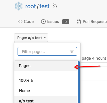
4. Add a "Pages" link in the dropdown, otherwise users can't go to the
Pages page easily.
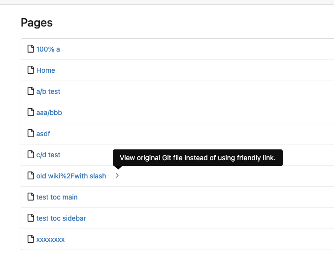
5. Add a "View original git file" link in the Pages list, even if some
file names are broken, users still have a chance to edit or remove it,
without cloning the wiki repo to local.
6. Fix 500 error when the name contains prefix spaces.
This PR also introduces the ability to support sub-directories, but it
can't be done at the moment due to there are a lot of legacy wiki data,
which use "%2F" in file names.
Co-authored-by: Giteabot <teabot@gitea.io>
A vertical overflow appears in Firefox 112/MacOS 12.6 when the system
setting for scrollbars is to "Always" show them.
---
Here, the fixed 100vw container widths are removed, which removes the
overflow. It is, however, only simulated in Developer Tools in latest
Firefox and Chromium, so please test on a Gitea installation.
The old code has a lot of technical debts, eg: `repo/wiki/view.tmpl` /
`Iterate`

This PR improves the Wiki TOC display and improves the code.

---------

Co-authored-by: delvh <dev.lh@web.de>