This is my first pr, there are many things I don't understand very well,
I am very sorry, I rearranged the code and opened this new pr.
Now:

Fixes: https://github.com/go-gitea/gitea/issues/25444

Followup for some regressions from
https://github.com/go-gitea/gitea/pull/25343. Before and after:

<img width="219" alt="Screenshot 2023-06-21 at 00 25 20"
src="08fe8e01-0a16-4cdf-ad4d-0a9048408e9e">
<img width="220" alt="Screenshot 2023-06-21 at 00 25 32"
src="be25ae69-6ed0-4af5-8eeb-d7b210e7c124">

Fixes mobile button background and margins:

<img width="836" alt="Screenshot 2023-06-21 at 00 39 58"
src="d76ac1e9-747f-477c-9a42-b73e129b72ee">
Close#20976Close#20975
1. Fix the bug: the TOC in footer was incorrectly rendered as main
content's TOC
2. Fix the layout: on mobile, the TOC is put above the main content,
while the sidebar is put below the main content
3. Auto collapse the TOC on mobile
ps: many styles of "wiki.css" are moved from old css files, so leave
nits to following PRs.
Fix  #25438

All non-"ok" buttons which do not have "type" should not submit the
form, should not be triggered by "Enter".

Co-authored-by: silverwind <me@silverwind.io>
Co-authored-by: Giteabot <teabot@gitea.io>
Make use of the [new
octicon](https://github.com/primer/octicons/issues/945) that indicates a
symlink to a directory:

<img width="189" alt="Screenshot 2023-06-22 at 22 50 57"
src="a70690ea-ebfc-48fe-af23-cdc33bcb2098">
Two small tweaks:

1. Vertically center arrow here when editing a PR:

<img width="405" alt="Screenshot 2023-06-20 at 19 48 49"
src="1d63764d-9fd9-467e-8a8e-9258c06475eb">

2. Use 2-row layout on diff viewed status and show it again on mobile:

<img width="142" alt="Screenshot 2023-06-20 at 19 51 21"
src="3046e782-163c-4f87-910c-a22066de8f1b">

Mobile view:

<img width="370" alt="Screenshot 2023-06-20 at 19 44 40"
src="9cf56347-7323-4d05-99a5-17ad215ee44d">
- Set
[type=search](https://developer.mozilla.org/en-US/docs/Web/HTML/Element/input/search)
- Disable spellcheck
- Set maxLength 255 that I found in `templates/repo/issue/search.tmpl`
- Remove unnecessary `max-width`, it does nothing

---------

Co-authored-by: delvh <dev.lh@web.de>
Co-authored-by: Giteabot <teabot@gitea.io>
Numerous small UI fixes:

- Fix double border in collaborator list
- Fix system notice table background
- Mute links in repo and org lists
- Downsize projects edit buttons
- Improve milestones and project list rendering
- Condense milestone list entry to a single line of "metas"
- Mute ".." button in repo files list
If enabled show a clickable label in the comment. A click on the label
opens the Conversation tab with the comment focussed - there you're able
to view the old diff (or original diff the comment was created on).
**Screenshots**


When resolved and outdated:

Option to enable/disable this (stored in user settings - default is
disabled):


fixes#24913
---------
Co-authored-by: silverwind <me@silverwind.io>
- The label text color on project board is not contrasting enough,
changed to colors that are same as places that also used
`useLightTextOnBackground` function
([util_render.go](2cdf260f42/modules/templates/util_render.go (L136-L141)),
[Context
Popup](2cdf260f42/web_src/js/components/ContextPopup.vue (L81-L84)))

- background of modal `content` is `#ffffff` (from fomantic) right now,
which does not look good on dark mode, so changed to `var(--color-body)`

Before:

<img width="1378" alt="Screen Shot 2023-06-21 at 14 24 13"
src="1527ca28-c884-4ca9-a4be-7a72ad1a093a">

<img width="900" alt="Screen Shot 2023-06-21 at 14 25 52"
src="fab82116-7376-4027-a0a4-9eedf9fb0a30">


After:

<img width="1383" alt="Screen Shot 2023-06-21 at 14 19 33"
src="fe0997e7-fee6-4522-bc4e-545088ec1cc8">

<img width="797" alt="Screen Shot 2023-06-21 at 14 32 42"
src="b0591af0-950c-4448-9430-34d6c7215971">
Part of #25042

1. Added actor and status dropdowns first in case something is offtrack
and PR is too large.

2. Also added "No results matched." and "The workflow has no runs yet.",
and "No results matched." will show if there is no filter results and
there is no workflows (with [reference to github
action](https://github.com/go-gitea/gitea/actions/workflows/files-changed.yml?query=actor%3AGiteaBot))

Demo:


6e76292c-4c1f-450d-8b48-99944cfc920c


TODOs:

- [x] Get available status (same as those in `aggregateJobStatus`)
instead of getting from database
- [x] Use `JOIN` to get actors, actors order by name
- [x] Make self on top
Address
https://github.com/go-gitea/gitea/pull/25163#issuecomment-1599207916
Remove the unused "icon-button".
And fix the layout:
Without the dropdown icon:
```
{{svg "gitea-whitespace"}}
```

With the dropdown icon:
```
{{svg "gitea-whitespace" 16 "gt-mr-3"}}
{{svg "octicon-triangle-down" 14 "dropdown icon"}}
```

- Extract navbar CSS to own file
- Reduce height from 52px to 50px
- Give every item a hover effect of of 36px, including the logo and on
mobile
- Consistent horizontal padding of 10px left and right

<img width="549" alt="Screenshot 2023-06-18 at 13 41 16"
src="0b00d101-253e-4b1f-9ee2-322d60fb2e26">

<img width="98" alt="Screenshot 2023-06-18 at 14 03 43"
src="4ef5d98b-4d1e-45de-822e-c2c844e19876">
<img width="234" alt="Screenshot 2023-06-18 at 14 03 18"
src="a4d9b04b-83de-42aa-a9ce-f010a9690688">

<img width="873" alt="Screenshot 2023-06-18 at 13 58 28"
src="8cb8e31e-2adf-40c8-ae3f-d00d011b4d1b">

---------

Co-authored-by: wxiaoguang <wxiaoguang@gmail.com>
Co-authored-by: Giteabot <teabot@gitea.io>
Fix#24846 applying the solution proposed by @silverwind
<details>
<summary>Screenshots</summary>


</details>
Replaces #25335
Fix regressions from https://github.com/go-gitea/gitea/pull/25219:

Math before and after:
<img width="630" alt="Screenshot 2023-06-18 at 16 00 52"
src="f2a01e4b-31ca-407c-8fc3-f0aec569b48e">
<img width="680" alt="Screenshot 2023-06-18 at 16 03 44"
src="faab8e39-f088-45ab-b460-15fc3654c99d">

Mermain before and after:
<img width="810" alt="Screenshot 2023-06-18 at 15 58 56"
src="d8c24e81-4702-4e17-b791-7dffe090c068">
<img width="786" alt="Screenshot 2023-06-18 at 15 58 37"
src="3a268e10-c071-410d-a66e-8c4427d1d61c">
We only needs 2 lines to hide the dividers.
```
$dropdownLabelFilter.dropdown('setting', {'hideDividers': 'empty'});
$dropdownLabelFilter.dropdown('refreshItems');
```
Other code blocks are refactored by the way.


A regression of #25210

The `e.target` is not "this", eg: `<button link-action><svg></button>`,
then `this` should be `button` but `e.target` is `svg`.

I will propose a clearer and complete solution for these "link-action"
"show-modal" elements after #24724

Co-authored-by: Giteabot <teabot@gitea.io>
Various fixes to pages or elements which were looking ugly on mobile.
<details>
<summary>Screenshots</summary>


</details>
Co-authored by @silverwind
---------
Co-authored-by: silverwind <me@silverwind.io>
- Update all JS dependencies
- Enable stylint
[`media-feature-name-value-no-unknown`](https://stylelint.io/user-guide/rules/media-feature-name-value-no-unknown)
- Make use of new features in webpack and text-expander-element
- Tested Swagger and Mermaid

To explain the `text-expander-element` change: Before this version, the
element added a unavoidable space after emoji completion. Now that
https://github.com/github/text-expander-element/pull/36 is in, we gain
control over this space and I opted to remove it for emoji completion
and retain it for `@` mentions.

---------

Co-authored-by: Giteabot <teabot@gitea.io>
Save another 50KB of CSS by removing unused and useless Fomantic
variants.

Removed the last instance if a `tertiary` button and fixed a TODO:

<img width="509" alt="Screenshot 2023-06-15 at 22 34 36"
src="8a16ae7b-2b17-439b-a096-60a52724e3d6">
Follow #23290
Network error won't make content lost. And this is a much better
approach than "loading-button".
The UI is not perfect and there are still some TODOs, they can be done
in following PRs, not a must in this PR's scope.
<details>

</details>
Fixes: https://github.com/go-gitea/gitea/issues/25282

Fix the problems:

1. The `repo-button-row` had various patches before, this PR makes it
consistent
2. The "Add File" has wrong CSS class "icon", remove it
3. The "Add File" padding was overridden by "!important", fix it by
`.repo-button-row .button.dropdown` with comment
4. The selector `.ui.segments ~ .ui.top.attached.header` is incorrect,
it should use `+`
It causes not only one issue like #25221 (the footer width was also
affected by that change and was fixed some time ago)

The problem of "overflow: overlay" (#21850) is:

* It's not widely supported and is non-standard
https://caniuse.com/css-overflow-overlay
* It's not widely tested in Gitea (some standard layout like `ui
container + ui grid` may break it).
* The benefit seems smaller than the problems it brings.

So, I think it is good to revert it.

----

Let's leave enough time for testing and reviewing.

---------

Co-authored-by: Giteabot <teabot@gitea.io>
Co-authored-by: silverwind <me@silverwind.io>
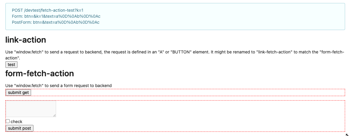
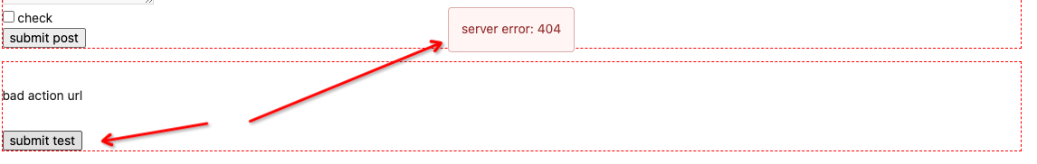
Clarify the "link-action" behavior:

>  // A "link-action" can post AJAX request to its "data-url"
> // Then the browser is redirect to: the "redirect" in response, or
"data-redirect" attribute, or current URL by reloading.

And enhance the "link-action" to support showing a modal dialog for
confirm. A similar general approach could also help PRs like
https://github.com/go-gitea/gitea/pull/22344#discussion_r1062883436

> // If the "link-action" has "data-modal-confirm(-html)" attribute, a
confirm modal dialog will be shown before taking action.


And a lot of duplicate code can be removed now. A good framework design
can help to avoid code copying&pasting.

---------

Co-authored-by: silverwind <me@silverwind.io>
The plan is that all built-in auth providers use inline SVG for more
flexibility in styling and to get the GitHub icon to follow
`currentcolor`. This only removes the `public/img/auth` directory and
adds the missing svgs to our svg build.

It should map the built-in providers to these SVGs and render them. If
the user has set a Icon URL, it should render that as an `img` tag
instead.

```
gitea-azure-ad
gitea-bitbucket
gitea-discord
gitea-dropbox
gitea-facebook
gitea-gitea
gitea-gitlab
gitea-google
gitea-mastodon
gitea-microsoftonline
gitea-nextcloud
gitea-twitter
gitea-yandex
octicon-mark-github
```

GitHub logo is now white again on dark theme:

<img width="431" alt="Screenshot 2023-06-12 at 21 45 34"
src="27a43504-d60a-4132-a502-336b25883e4d">

---------

Co-authored-by: wxiaoguang <wxiaoguang@gmail.com>
The current UI to create API access tokens uses checkboxes that have a
complicated relationship where some need to be checked and/or disabled
in certain states. It also requires that a user interact with it to
understand what their options really are.

This branch changes to use `<select>`s. It better fits the available
options, and it's closer to [GitHub's
UI](https://github.com/settings/personal-access-tokens/new), which is
good, in my opinion. It's more mobile friendly since the tap-areas are
larger. If we ever add more permissions, like Maintainer, there's a
natural place that doesn't take up more screen real-estate.

This branch also fixes a few minor issues:

- Hide the error about selecting at least one permission after second
submission
- Fix help description to call it "authorization" since that's what
permissions are about (not authentication)

Related: #24767.

<img width="883" alt="Screenshot 2023-06-07 at 5 07 34 PM"
src="6b63d807-c9be-4a4b-8e53-ecab6cbb8f76">

---

When it's open:

<img width="881" alt="Screenshot 2023-06-07 at 5 07 59 PM"
src="2432c6d0-39c2-4ca4-820e-c878ffdbfb69">
Fixes#25160.
`data-source-position` of checkboxes in a task list was incorrect
whenever there was YAML front matter. This would result in issue content
or PR descriptions getting corrupted with random `x` or space characters
when a user checked or unchecked a task.
According to my test, the UI (emoji) is fine in Safari

And actually the code is just dead code, because the "resize" event is
never fired on page loading. So for most cases users just view the pages
without this hacky patch, nobody ever complains.
An error occurs when clicking on `show full screen` on action page.

<img width="1440" alt="Screen Shot 2023-06-12 at 13 06 52"
src="1d4ded3c-fb77-4dd8-9201-24d0696f96eb">

class name has changed in #25134, so the selector is not working.
Enhance the selectors to fix this.
- Fix and improve mobile navbar layout
- Apply all cleanups suggested in
https://github.com/go-gitea/gitea/pull/25111
- Make media query breakpoints match Fomantic's exactly
- Clean up whitespace in class on navbar items

Mobile navbar before and after:
<img width="745" alt="Screenshot 2023-06-08 at 08 40 56"
src="ca84b239-b10f-41db-8c06-dcf2b6dd9d28">
<img width="739" alt="Screenshot 2023-06-08 at 08 41 23"
src="09133c54-eb7e-4110-858c-ead23c3b7521">

---------

Co-authored-by: wxiaoguang <wxiaoguang@gmail.com>
Co-authored-by: Giteabot <teabot@gitea.io>
- Various corrections to button styles, especially secondary
- Remove focus highlight, it's annoying when it stays on button after
press
- Clearly define ghost and link buttons with demos in devtest
- Remove black, grey and tertiary buttons, they should not be used
- Make `arc-green` slightly darker

<img width="1226" alt="image"
src="8d89786a-01ab-40f8-ae5a-e17f40e35084">
<img width="1249" alt="image"
src="83651e6d-3c27-46ff-b8bd-ff344d70e949">

---------

Co-authored-by: wxiaoguang <wxiaoguang@gmail.com>
Co-authored-by: Giteabot <teabot@gitea.io>
Close#24808
Co-Authour @wxiaoguang @silverwind
1. Most svgs are found from https://worldvectorlogo.com/ , and some are
from conversion of png to svg. (facebook and nextcloud). And also
changed `templates/user/settings/security/accountlinks.tmpl`.
2. Fixed display name and iconurl related logic
# After
<img width="1436" alt="Screen Shot 2023-06-05 at 14 09 05"
src="a5db39d8-1ab0-4676-82a4-fba60a1d1f84">
On mobile
<img width="378" alt="Screen Shot 2023-06-05 at 14 09 46"
src="71d0f51b-baac-4f48-8ca2-ae0e013bd62e">
user/settings/security/accountlinks (The dropdown might be improved
later)
<img width="973" alt="Screen Shot 2023-06-01 at 10 01 44"
src="27010e7e-2785-4fc5-8c49-b06621898f37">
---------
Co-authored-by: silverwind <me@silverwind.io>
Co-authored-by: wxiaoguang <wxiaoguang@gmail.com>
Fixes https://github.com/go-gitea/gitea/issues/25130

The old code uses `$(this).next()` to get `dismiss-review-modal`.
At first, it will get `$(#dismiss-review-modal)`, but the next time it
will get `$(#dismiss-review-modal).next();`
and then `$(#dismiss-review-modal).next().next();`.
Because div `dismiss-review-modal` will be removed when
`dismiss-review-btn` clicked.

Maybe the right usage is adding `show-modal` class and `data-modal`
attribute.
Improvements to the notification icon and `<nav>`:

- Add a opaque color for header hover and use it, allowing the border to
be the right color on hover (sadly, not otherwise possible with CSS, not
even `color-mix`).
- Increase font size by 1px
- Use flexbox for slightly better text centering
- Reduce padding of user and add repo button, add margin on right side
of user menu
- Remove the `following bar` wrapper on navbar

<img width="176" alt="Screenshot 2023-06-07 at 00 07 08"
src="23cdc3d6-7f63-49df-bec3-f2e75e32a304">
<img width="63" alt="Screenshot 2023-06-07 at 00 07 14"
src="fae602c2-4467-4d50-b1ec-56317843f9a2">
<img width="84" alt="Screenshot 2023-06-07 at 00 07 36"
src="c48141b8-0b3c-48cc-846a-3a272524dbdb">
<img width="329" alt="Screenshot 2023-06-07 at 00 25 10"
src="cda612f1-426e-466b-a351-fc992bfd18fd">
<img width="186" alt="Screenshot 2023-06-07 at 00 35 45"
src="04484a2e-9bbf-493c-aa26-8e936da008fa">
<img width="797" alt="Screenshot 2023-06-07 at 16 57 40"
src="e7ccb672-5807-4cb6-b306-b18ae0c7e321">