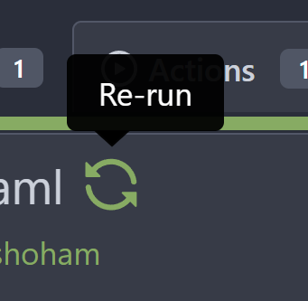
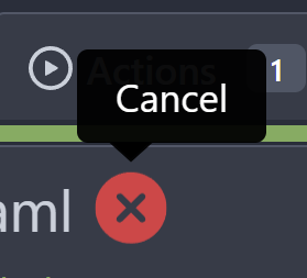
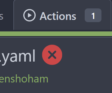
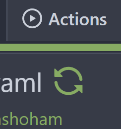
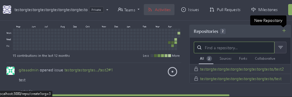
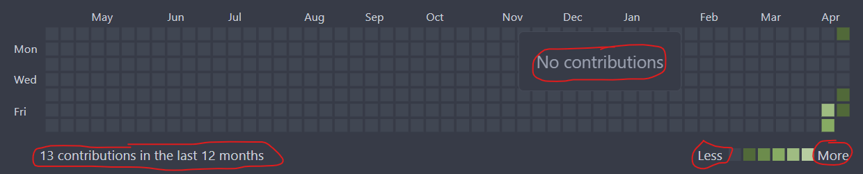
It will show the calculated commit status state of the latest commit on
the default branch for each repository in the dashboard repo list
- Closes#15620
# Before

# After

---------
Signed-off-by: Yarden Shoham <git@yardenshoham.com>
Co-authored-by: delvh <dev.lh@web.de>
Co-authored-by: Giteabot <teabot@gitea.io>
Fix regression from https://github.com/go-gitea/gitea/pull/24648 where
it was hiding non-tooltip tippy instances, like for example in the
review panel which itself is a tippy instance, but with a different
`role`.
Fix regression from https://github.com/go-gitea/gitea/pull/24476 where
the `svg.svg` class misaligns SVG icons across the site and streched
buttons unintentionally in vertical height.

Before (button 30.3px):
<img width="157" alt="Screenshot 2023-05-11 at 22 09 42"
src="0fd137ab-ab52-4cf8-afca-c45776d526d0">

After (button 30px):
<img width="160" alt="Screenshot 2023-05-11 at 22 09 59"
src="4b741f4b-0fd2-4fae-9bee-16a7deb098e8">

[vertical-align:
middle](https://developer.mozilla.org/en-US/docs/Web/CSS/vertical-align)
is not suitable to align icons to text because

> Aligns the middle of the element with the baseline plus half the
x-height of the parent.

Example of `vertical-align: middle` from MDN:

<img width="232" alt="Screenshot 2023-05-11 at 22 29 28"
src="179fb756-85a1-4cab-8219-1a4958f333e2">

So I think the
[existing](365bb77a54/web_src/css/svg.css (L3))
`vertical-align: text-top` is generally still the best bet:

<img width="241" alt="Screenshot 2023-05-11 at 22 34 24"
src="0cd6edf5-12c0-4bdb-8771-a900f5ba2d35">

Co-authored-by: Giteabot <teabot@gitea.io>
Before:

After:

private or internal repos have `lock` icon, no need to add highlights to
them.
Because our tippy instances have an `interactiveBorder`, it's possible
to bring up two instances at once, which is undesirable.

<img width="256" alt="Screenshot 2023-05-10 at 23 03 04"
src="3a9a1775-78c1-46d4-a8a5-503ab7dca0d8">

Prevent this by keeping track of visible tippy instances and hiding
others when one is shown. Tippy also has the [singleton
addon](https://atomiks.github.io/tippyjs/v6/addons/#singleton) for the
same purpose, but it's unsuitable to us because we don't init all
tooltips at once.
This one doesn't look very good as a real button (at least not in the
ways I tried), so I've opted to simply add a tooltip for it.
# Before

# After

Signed-off-by: Yarden Shoham <git@yardenshoham.com>
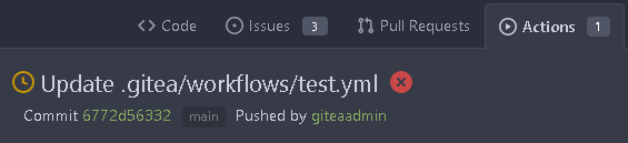
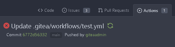
To clearly communicate the current state of the action


---------
Signed-off-by: Yarden Shoham <git@yardenshoham.com>
Partially for #24457
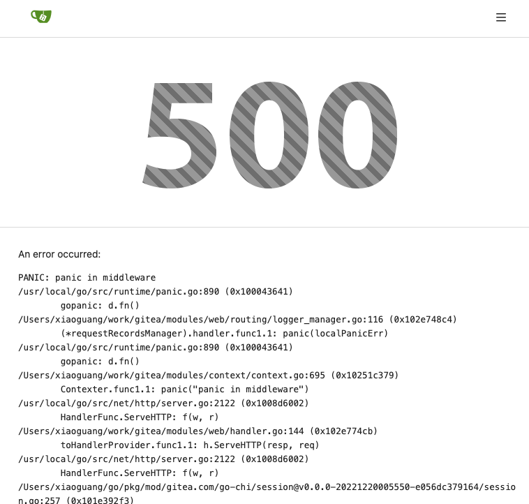
Major changes:
1. The old `signedUserNameStringPointerKey` is quite hacky, use
`ctx.Data[SignedUser]` instead
2. Move duplicate code from `Contexter` to `CommonTemplateContextData`
3. Remove incorrect copying&pasting code `ctx.Data["Err_Password"] =
true` in API handlers
4. Use one unique `RenderPanicErrorPage` for panic error page rendering
5. Move `stripSlashesMiddleware` to be the first middleware
6. Install global panic recovery handler, it works for both `install`
and `web`
7. Make `500.tmpl` only depend minimal template functions/variables,
avoid triggering new panics
Screenshot:
<details>
</details>
Partial regression of #24393, not only regression, but broken for long
time, 24393 didn't really improve it but used wrong `overflow: scroll`.

Actually, that "ui secondary filter menu labels" shouldn't be set as
scrollable (I missed that at that time), the problem is: if a "ui menu"
has "dropdown" items, then it should not be scrollable. Otherwise the
dropdown menu can't be shown correctly.

And there are more problems:

* The "issue-filters" shouldn't be used anywhere else (copying&pasting
problem again ....)
* There is also an "issue-actions" container, it should also be fixed.
* There are similar problems on the milestone page.
* The old comment in code: "grid column" doesn't work well.

The major changes of this PR are: use "flex: 1" instead of "ui grid
column".

After this PR, not 100% perfect but much better than before.
Co-Author: @wxiaoguang
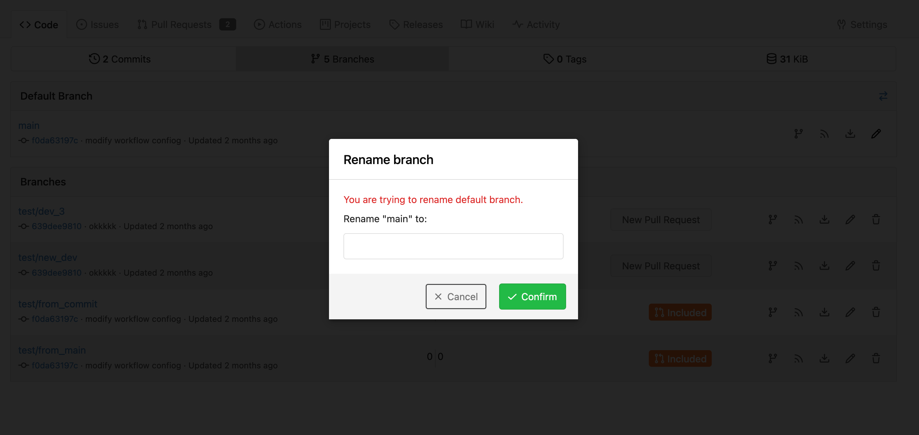
It is more convenient that user just need to enter a new branch name after he selects the branch which he want to rename.
So this PR move the function of renaming branch to the page of branches list.
This PR also restyle the button of `new branch`, `download`, `delete`....
https://user-images.githubusercontent.com/33891828/235277997-413060bb-759f-430a-b5c4-df5e40ffcd28.mov
---------
Co-authored-by: wxiaoguang <wxiaoguang@gmail.com>
Follow #22719
### Major changes
1. `ServerError` doesn't do format, so remove the `%s`
2. Simplify `RenderBranchFeed` (slightly)
3. Remove unused `BranchFeedRSS`
4. Make `feed.RenderBranchFeed` respect `EnableFeed` config
5. Make `RepoBranchTagSelector.vue` respect `EnableFeed` setting,
otherwise there is always RSS icon
6. The `(branchURLPrefix + item.url).replace('src', 'rss')` doesn't seem
right for all cases, for example, the string `src` could appear in
`branchURLPrefix`, so we need a separate `rssURLPrefix`
7. The `<a>` in Vue menu needs `@click.stop`, otherwise the menu itself
would be triggered at the same time
8. Change `<a><button></button></a>` to `<a role=button>`
9. Use `{{PathEscapeSegments .TreePath}}` instead of `{{range $i, $v :=
.TreeNames}}/{{$v}}{{end}}`
Screenshot of changed parts:
<details>
</details>
### Other thoughts
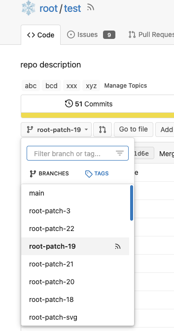
Should we remove the RSS icon from the branch dropdown list? It seems
too complex for a list UI, and users already have the chance to get the
RSS feed URL from "branches" page.
---------
Co-authored-by: 6543 <6543@obermui.de>
Co-authored-by: silverwind <me@silverwind.io>
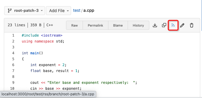
Fix#22228 adding RSS feeds for branches and files.
RSS feeds are accessed through:
* [gitea]/src/branch/{branch}.rss
* [gitea]/src/branch/{branch}/{file_name}.rss
No changes have been made to the UI to expose the feed urls for branches
and files.
Close#24195
Some of the changes are taken from my another fix
f07b0de997
in #20147 (although that PR was discarded ....)
The bug is:
1. The old code doesn't handle `removedfile` event correctly
2. The old code doesn't provide attachments for type=CommentTypeReview
This PR doesn't intend to refactor the "upload" code to a perfect state
(to avoid making the review difficult), so some legacy styles are kept.
---------
Co-authored-by: silverwind <me@silverwind.io>
Co-authored-by: Giteabot <teabot@gitea.io>
Close#7570
1. Clearly define the wiki path behaviors, see
`services/wiki/wiki_path.go` and tests
2. Keep compatibility with old contents
3. Allow to use dashes in titles, eg: "2000-01-02 Meeting record"
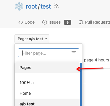
4. Add a "Pages" link in the dropdown, otherwise users can't go to the
Pages page easily.
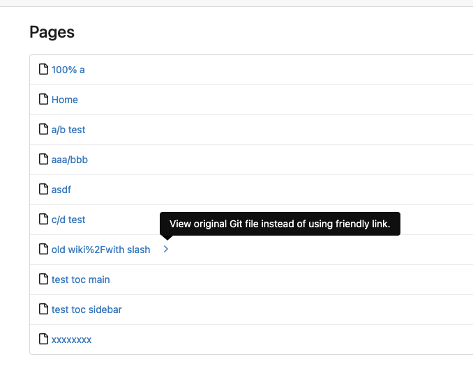
5. Add a "View original git file" link in the Pages list, even if some
file names are broken, users still have a chance to edit or remove it,
without cloning the wiki repo to local.
6. Fix 500 error when the name contains prefix spaces.
This PR also introduces the ability to support sub-directories, but it
can't be done at the moment due to there are a lot of legacy wiki data,
which use "%2F" in file names.
Co-authored-by: Giteabot <teabot@gitea.io>
This matches EasyMDE, and makes it easier to find the right user without
having to remember the exact name.

---------

Co-authored-by: silverwind <me@silverwind.io>