Use our existing color palette to map to the 16 basic ansi colors. This
is backwards-compatible because it aliases the existing color names.

Side note: I think the colors in `console.css` for console file
rendering are incomplete, but fixing those is out of scope here imo.

Before and after:

<img width="542" alt="Screenshot 2023-06-28 at 00 26 12"
src="86d41884-bc47-4e85-8aec-621eb7320f0b">

<img width="546" alt="Screenshot 2023-06-28 at 00 28 24"
src="39fa3b37-d49e-49b1-b6bc-390ac8ca24b2">

---------

Co-authored-by: Giteabot <teabot@gitea.io>
- Update all JS dependencies
- Enable `declaration-property-unit-disallowed-list` to forbid `em` on
`line-height`
- Rename dependency update targets to `update-js` and `update-py` and
document them
- Remove margin on Asciicast viewer
- Tested Swagger, Katex, Asciicast

<img width="1243" alt="Screenshot 2023-06-27 at 19 51 05"
src="2d2722a0-2aa7-4f4c-b8bd-17e1f3637b78">
Right now rerun icon on action view component will not be seen when
duration text length is long, because the wrapper `job-brief-info` has a
fixed width, and the svg is squeezed. The way to fix this in this PR is
to change width to `fit-content` and exchange position of duration text
and rerun svg.

Before (rerun svg not shown on hover):

<img width="1401" alt="Screen Shot 2023-06-27 at 12 53 41"
src="bb3f62ec-8c56-4dbc-96f1-718b50426d91">

After:

<img width="1409" alt="Screen Shot 2023-06-27 at 12 50 59"
src="620aa02c-2326-408d-a763-453f48f42c40">
This is my first pr, there are many things I don't understand very well,
I am very sorry, I rearranged the code and opened this new pr.
Now:

Fixes: https://github.com/go-gitea/gitea/issues/25444

Followup for some regressions from
https://github.com/go-gitea/gitea/pull/25343. Before and after:

<img width="219" alt="Screenshot 2023-06-21 at 00 25 20"
src="08fe8e01-0a16-4cdf-ad4d-0a9048408e9e">
<img width="220" alt="Screenshot 2023-06-21 at 00 25 32"
src="be25ae69-6ed0-4af5-8eeb-d7b210e7c124">

Fixes mobile button background and margins:

<img width="836" alt="Screenshot 2023-06-21 at 00 39 58"
src="d76ac1e9-747f-477c-9a42-b73e129b72ee">
Close#20976Close#20975
1. Fix the bug: the TOC in footer was incorrectly rendered as main
content's TOC
2. Fix the layout: on mobile, the TOC is put above the main content,
while the sidebar is put below the main content
3. Auto collapse the TOC on mobile
ps: many styles of "wiki.css" are moved from old css files, so leave
nits to following PRs.
Fix  #25438

All non-"ok" buttons which do not have "type" should not submit the
form, should not be triggered by "Enter".

Co-authored-by: silverwind <me@silverwind.io>
Co-authored-by: Giteabot <teabot@gitea.io>
Make use of the [new
octicon](https://github.com/primer/octicons/issues/945) that indicates a
symlink to a directory:

<img width="189" alt="Screenshot 2023-06-22 at 22 50 57"
src="a70690ea-ebfc-48fe-af23-cdc33bcb2098">
Two small tweaks:

1. Vertically center arrow here when editing a PR:

<img width="405" alt="Screenshot 2023-06-20 at 19 48 49"
src="1d63764d-9fd9-467e-8a8e-9258c06475eb">

2. Use 2-row layout on diff viewed status and show it again on mobile:

<img width="142" alt="Screenshot 2023-06-20 at 19 51 21"
src="3046e782-163c-4f87-910c-a22066de8f1b">

Mobile view:

<img width="370" alt="Screenshot 2023-06-20 at 19 44 40"
src="9cf56347-7323-4d05-99a5-17ad215ee44d">
- Set
[type=search](https://developer.mozilla.org/en-US/docs/Web/HTML/Element/input/search)
- Disable spellcheck
- Set maxLength 255 that I found in `templates/repo/issue/search.tmpl`
- Remove unnecessary `max-width`, it does nothing

---------

Co-authored-by: delvh <dev.lh@web.de>
Co-authored-by: Giteabot <teabot@gitea.io>
Numerous small UI fixes:

- Fix double border in collaborator list
- Fix system notice table background
- Mute links in repo and org lists
- Downsize projects edit buttons
- Improve milestones and project list rendering
- Condense milestone list entry to a single line of "metas"
- Mute ".." button in repo files list
If enabled show a clickable label in the comment. A click on the label
opens the Conversation tab with the comment focussed - there you're able
to view the old diff (or original diff the comment was created on).
**Screenshots**


When resolved and outdated:

Option to enable/disable this (stored in user settings - default is
disabled):


fixes#24913
---------
Co-authored-by: silverwind <me@silverwind.io>
- The label text color on project board is not contrasting enough,
changed to colors that are same as places that also used
`useLightTextOnBackground` function
([util_render.go](2cdf260f42/modules/templates/util_render.go (L136-L141)),
[Context
Popup](2cdf260f42/web_src/js/components/ContextPopup.vue (L81-L84)))

- background of modal `content` is `#ffffff` (from fomantic) right now,
which does not look good on dark mode, so changed to `var(--color-body)`

Before:

<img width="1378" alt="Screen Shot 2023-06-21 at 14 24 13"
src="1527ca28-c884-4ca9-a4be-7a72ad1a093a">

<img width="900" alt="Screen Shot 2023-06-21 at 14 25 52"
src="fab82116-7376-4027-a0a4-9eedf9fb0a30">


After:

<img width="1383" alt="Screen Shot 2023-06-21 at 14 19 33"
src="fe0997e7-fee6-4522-bc4e-545088ec1cc8">

<img width="797" alt="Screen Shot 2023-06-21 at 14 32 42"
src="b0591af0-950c-4448-9430-34d6c7215971">
Part of #25042

1. Added actor and status dropdowns first in case something is offtrack
and PR is too large.

2. Also added "No results matched." and "The workflow has no runs yet.",
and "No results matched." will show if there is no filter results and
there is no workflows (with [reference to github
action](https://github.com/go-gitea/gitea/actions/workflows/files-changed.yml?query=actor%3AGiteaBot))

Demo:


6e76292c-4c1f-450d-8b48-99944cfc920c


TODOs:

- [x] Get available status (same as those in `aggregateJobStatus`)
instead of getting from database
- [x] Use `JOIN` to get actors, actors order by name
- [x] Make self on top
Address
https://github.com/go-gitea/gitea/pull/25163#issuecomment-1599207916
Remove the unused "icon-button".
And fix the layout:
Without the dropdown icon:
```
{{svg "gitea-whitespace"}}
```

With the dropdown icon:
```
{{svg "gitea-whitespace" 16 "gt-mr-3"}}
{{svg "octicon-triangle-down" 14 "dropdown icon"}}
```

- Extract navbar CSS to own file
- Reduce height from 52px to 50px
- Give every item a hover effect of of 36px, including the logo and on
mobile
- Consistent horizontal padding of 10px left and right

<img width="549" alt="Screenshot 2023-06-18 at 13 41 16"
src="0b00d101-253e-4b1f-9ee2-322d60fb2e26">

<img width="98" alt="Screenshot 2023-06-18 at 14 03 43"
src="4ef5d98b-4d1e-45de-822e-c2c844e19876">
<img width="234" alt="Screenshot 2023-06-18 at 14 03 18"
src="a4d9b04b-83de-42aa-a9ce-f010a9690688">

<img width="873" alt="Screenshot 2023-06-18 at 13 58 28"
src="8cb8e31e-2adf-40c8-ae3f-d00d011b4d1b">

---------

Co-authored-by: wxiaoguang <wxiaoguang@gmail.com>
Co-authored-by: Giteabot <teabot@gitea.io>
Fix#24846 applying the solution proposed by @silverwind
<details>
<summary>Screenshots</summary>


</details>
Replaces #25335
Fix regressions from https://github.com/go-gitea/gitea/pull/25219:

Math before and after:
<img width="630" alt="Screenshot 2023-06-18 at 16 00 52"
src="f2a01e4b-31ca-407c-8fc3-f0aec569b48e">
<img width="680" alt="Screenshot 2023-06-18 at 16 03 44"
src="faab8e39-f088-45ab-b460-15fc3654c99d">

Mermain before and after:
<img width="810" alt="Screenshot 2023-06-18 at 15 58 56"
src="d8c24e81-4702-4e17-b791-7dffe090c068">
<img width="786" alt="Screenshot 2023-06-18 at 15 58 37"
src="3a268e10-c071-410d-a66e-8c4427d1d61c">
We only needs 2 lines to hide the dividers.
```
$dropdownLabelFilter.dropdown('setting', {'hideDividers': 'empty'});
$dropdownLabelFilter.dropdown('refreshItems');
```
Other code blocks are refactored by the way.


A regression of #25210

The `e.target` is not "this", eg: `<button link-action><svg></button>`,
then `this` should be `button` but `e.target` is `svg`.

I will propose a clearer and complete solution for these "link-action"
"show-modal" elements after #24724

Co-authored-by: Giteabot <teabot@gitea.io>
Various fixes to pages or elements which were looking ugly on mobile.
<details>
<summary>Screenshots</summary>


</details>
Co-authored by @silverwind
---------
Co-authored-by: silverwind <me@silverwind.io>
- Update all JS dependencies
- Enable stylint
[`media-feature-name-value-no-unknown`](https://stylelint.io/user-guide/rules/media-feature-name-value-no-unknown)
- Make use of new features in webpack and text-expander-element
- Tested Swagger and Mermaid

To explain the `text-expander-element` change: Before this version, the
element added a unavoidable space after emoji completion. Now that
https://github.com/github/text-expander-element/pull/36 is in, we gain
control over this space and I opted to remove it for emoji completion
and retain it for `@` mentions.

---------

Co-authored-by: Giteabot <teabot@gitea.io>
Save another 50KB of CSS by removing unused and useless Fomantic
variants.

Removed the last instance if a `tertiary` button and fixed a TODO:

<img width="509" alt="Screenshot 2023-06-15 at 22 34 36"
src="8a16ae7b-2b17-439b-a096-60a52724e3d6">
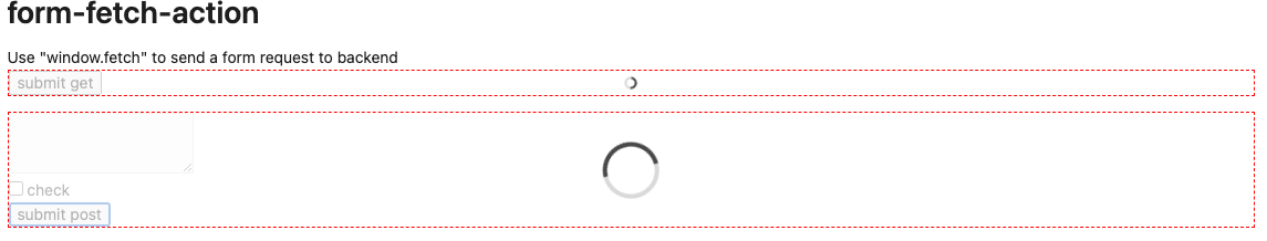
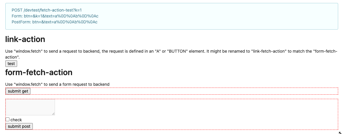
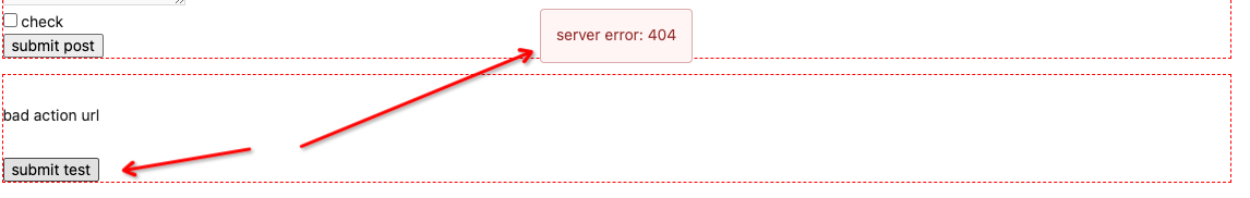
Follow #23290
Network error won't make content lost. And this is a much better
approach than "loading-button".
The UI is not perfect and there are still some TODOs, they can be done
in following PRs, not a must in this PR's scope.
<details>

</details>
Fixes: https://github.com/go-gitea/gitea/issues/25282

Fix the problems:

1. The `repo-button-row` had various patches before, this PR makes it
consistent
2. The "Add File" has wrong CSS class "icon", remove it
3. The "Add File" padding was overridden by "!important", fix it by
`.repo-button-row .button.dropdown` with comment
4. The selector `.ui.segments ~ .ui.top.attached.header` is incorrect,
it should use `+`
It causes not only one issue like #25221 (the footer width was also
affected by that change and was fixed some time ago)

The problem of "overflow: overlay" (#21850) is:

* It's not widely supported and is non-standard
https://caniuse.com/css-overflow-overlay
* It's not widely tested in Gitea (some standard layout like `ui
container + ui grid` may break it).
* The benefit seems smaller than the problems it brings.

So, I think it is good to revert it.

----

Let's leave enough time for testing and reviewing.

---------

Co-authored-by: Giteabot <teabot@gitea.io>
Co-authored-by: silverwind <me@silverwind.io>
Clarify the "link-action" behavior:

>  // A "link-action" can post AJAX request to its "data-url"
> // Then the browser is redirect to: the "redirect" in response, or
"data-redirect" attribute, or current URL by reloading.

And enhance the "link-action" to support showing a modal dialog for
confirm. A similar general approach could also help PRs like
https://github.com/go-gitea/gitea/pull/22344#discussion_r1062883436

> // If the "link-action" has "data-modal-confirm(-html)" attribute, a
confirm modal dialog will be shown before taking action.


And a lot of duplicate code can be removed now. A good framework design
can help to avoid code copying&pasting.

---------

Co-authored-by: silverwind <me@silverwind.io>