Fix ::User Profile Page Project Tab Have Inconsistent Layout and Style
Added the big_avator for consistency in the all header_items tabs.
Fixes: #24871
> ### Description
> in the user profile page the `Packages` and `Projects` tab have small
icons for user but other tabs have bigger profile picture with user
info:
>
> ### Screenshots
> ### **For Packages And Projects:**
>

>
> ### **For Other Tabs:**
>

>
## Before

## After changes
Project View
<img width="1394" alt="image"
src="95d181d7-8e61-496d-9899-7b825c91ad56">
Packages View
<img width="1378" alt="image"
src="7f5fd60f-6b18-4fa8-8c56-7b0d45d1a610">
## Org view for projects page
<img width="1385" alt="image"
src="6400dc89-a5ae-4f0a-831b-5b6efa020d89">
## Org view for packages page
<img width="1387" alt="image"
src="4e1e9ffe-1e4b-4334-8657-de11b5fd31d0">
---------
Co-authored-by: wxiaoguang <wxiaoguang@gmail.com>
Co-authored-by: Giteabot <teabot@gitea.io>
Co-authored-by: silverwind <me@silverwind.io>
gitea allows to create empty PRs.
Currently when you need approvals for a merge, you have to manually add
/files to the url to get to the files tab to approve / reject the PR.
This PR allows to open the files tab via the normal tab / link and then
fixes the layout of the files tab.
**Screenshots:**
Before:

After:

---------
Co-authored-by: silverwind <me@silverwind.io>
Co-authored-by: Giteabot <teabot@gitea.io>
Various small enhancements to the actions list. Before and after:

<img width="1264" alt="Screenshot 2023-06-30 at 00 11 40"
src="bb4162ee-cdcf-4a73-b05e-f9521562edbb">
<img width="1264" alt="Screenshot 2023-06-30 at 00 09 51"
src="52a70ea9-4bb3-406e-904b-0fdaafde9582">

---------

Co-authored-by: Giteabot <teabot@gitea.io>
Fix#25628
Diff with ignoring space:
https://github.com/go-gitea/gitea/pull/25629/files?diff=unified&w=1
The "modal" shouldn't appear between "ui attached segment", otherwise
these segments lose margin-top.
After the fix:
<details>


</details>
Replace #25446, fix#25438
All "cancel" buttons which do not have "type" should not submit the
form, should not be triggered by "Enter".
This is a complete fix for all modal dialogs.
The major change is "modules/aria/modal.js", "devtest" related code is
for demo/test purpose.
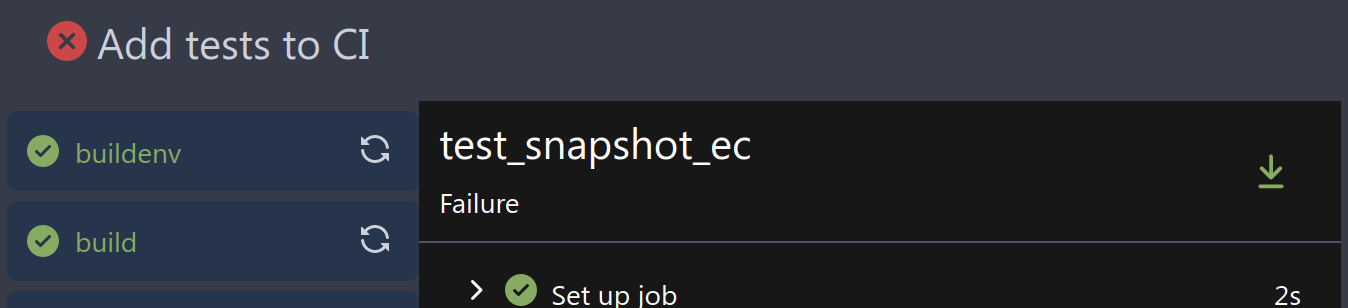
Fix#10388
This PR adds a status icon for every branch which has a status check for
the latest commit on branch list page.
<img width="1313" alt="图片"
src="727cd540-d03a-40c6-a7dd-e87c118af0ac">
Fix#25558
Extract from #22743
This PR added a repository's check when creating/deleting branches via
API. Mirror repository and archive repository cannot do that.
the PullHeadCommitID is not always available when the PR is merged.

Not sure if this is the best solution but in my simple tests it looks
like this fixes the problem - happy to get any feedback.

hopefully fixes https://github.com/go-gitea/gitea/issues/24813
This adds an API for uploading and Deleting Avatars for of Users, Repos
and Organisations. I'm not sure, if this should also be added to the
Admin API.
Resolves#25344
---------
Co-authored-by: silverwind <me@silverwind.io>
Co-authored-by: Giteabot <teabot@gitea.io>
This pull request fades read-only checkboxes and checkmark, and it makes
the checkboxes act more read-only/disabled by not changing the
border-color when clicked.
Examples using light mode:
| Before | After |
| - | - |
| 
| 
|
| 
| 
|
| | read-only checkboxes and checkmark are faded<br>and the checkboxes
act more read-only/disabled |
Fixes/Closes/Resolves #25076
---------
Co-authored-by: silverwind <me@silverwind.io>
Co-authored-by: wxiaoguang <wxiaoguang@gmail.com>
Related #25559

Current behaviour:
1. Deletion of a package version
2. Redirect to the owners package list

New behaviour:
1. Deletion of a package version
2.1. If there are more versions available, redirect to the package again
2.2. If there are no versions available, redirect to the owners package
list
Should look exactly like before for normal dividers. "Horizontal" ones
look better because they no longer use image backgrounds.

<img width="917" alt="Screenshot 2023-06-27 at 19 07 56"
src="d97d8dec-6859-44a8-85ba-e4549b4dd9df">

<img width="914" alt="Screenshot 2023-06-27 at 19 05 58"
src="8bf98544-2d82-4ebf-ac68-d6dc237bd6b2">

<img width="1246" alt="Screenshot 2023-06-27 at 19 00 42"
src="36a6bb21-6029-4f53-8bee-535f55c66fed">

<img width="344" alt="Screenshot 2023-06-27 at 18 58 15"
src="a9e70aee-8e6b-4ea1-9e93-19c9f96aec6e">
<img width="823" alt="Screenshot 2023-06-27 at 18 56 22"
src="e7a497cd-f262-4683-8872-23c3c8cce32f">

<img width="330" alt="Screenshot 2023-06-27 at 19 21 11"
src="42f24149-a655-4c7e-bd26-8ab52db6446b">
Related #14180
Related #25233
Related #22639Close#19786
Related #12763
This PR will change all the branches retrieve method from reading git
data to read database to reduce git read operations.
- [x] Sync git branches information into database when push git data
- [x] Create a new table `Branch`, merge some columns of `DeletedBranch`
into `Branch` table and drop the table `DeletedBranch`.
- [x] Read `Branch` table when visit `code` -> `branch` page
- [x] Read `Branch` table when list branch names in `code` page dropdown
- [x] Read `Branch` table when list git ref compare page
- [x] Provide a button in admin page to manually sync all branches.
- [x] Sync branches if repository is not empty but database branches are
empty when visiting pages with branches list
- [x] Use `commit_time desc` as the default FindBranch order by to keep
consistent as before and deleted branches will be always at the end.
---------
Co-authored-by: Jason Song <i@wolfogre.com>
Before:

<img width="364" alt="Screen Shot 2023-06-20 at 11 59 11"
src="ad284b7e-8d21-43be-b178-bbcfd37cb5bd">

Might trigger many posts when keep clicking the buttons above.

<img width="448" alt="Screen Shot 2023-06-20 at 11 52 28"
src="a60aa6ac-af74-45e4-b13a-512b436b81b0">
<img width="678" alt="Screen Shot 2023-06-20 at 11 52 37"
src="d6662700-3643-4cc7-a2ec-64e1c0f5fbdb">

After (PR sidebar, Same for issue):


9df3ad1f-e29c-439b-8bde-e6b917d63cc6

For delete, it is using `base/modal_actions_confirm` subtemplate, and we
might need another general solution for this (maybe add another
attribute to the subtemplate or something)

---------

Co-authored-by: silverwind <me@silverwind.io>
Co-authored-by: Giteabot <teabot@gitea.io>
Co-authored-by: wxiaoguang <wxiaoguang@gmail.com>
releated to #21820
- Split `Size` in repository table as two new colunms, one is `GitSize`
for git size, the other is `LFSSize` for lfs data. still store full size
in `Size` colunm.
- Show full size on ui, but show each of them by a `title`; example:
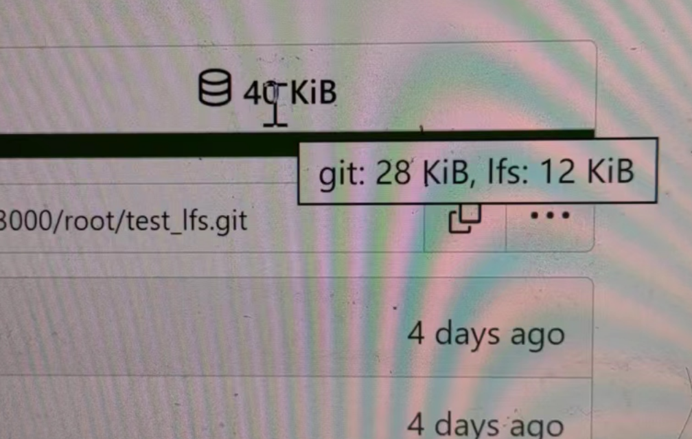
- Return full size in api response.
---------
Signed-off-by: a1012112796 <1012112796@qq.com>
Co-authored-by: Lunny Xiao <xiaolunwen@gmail.com>
Co-authored-by: silverwind <me@silverwind.io>
Co-authored-by: DmitryFrolovTri <23313323+DmitryFrolovTri@users.noreply.github.com>
Co-authored-by: Giteabot <teabot@gitea.io>
In the process of doing a bit of automation via the API, we've
discovered a _small_ issue in the Swagger definition. We tried to create
a push mirror for a repository, but our generated client raised an
exception due to an unexpected status code.

When looking at this function:

3c7f5ed7b5/routers/api/v1/repo/mirror.go (L236-L240)

We see it defines `201 - Created` as response:

3c7f5ed7b5/routers/api/v1/repo/mirror.go (L260-L262)

But it actually returns `200 - OK`:

3c7f5ed7b5/routers/api/v1/repo/mirror.go (L373)

So I've just updated the Swagger definitions to match the code😀

---------

Co-authored-by: Giteabot <teabot@gitea.io>
Right now some sort buttons beside search input are unclickable because
#25338 removed `max-width` and the sort button is using float, sort
button is then covered by the `input`.

The way to fix this in this PR is changing the layout to `flex` and put
`input form` and sort `button` into `secondary menu`.

After:

<img width="1411" alt="Screen Shot 2023-06-26 at 16 40 52"
src="63c12b17-793a-4ae7-bbda-f67b13b87212">

<img width="1428" alt="Screen Shot 2023-06-26 at 16 34 06"
src="cb7d967e-355d-4cb0-955c-6139580fc17a">
<img width="716" alt="Screen Shot 2023-06-26 at 16 34 22"
src="c74b5ef2-d46e-4487-8794-28bec984bb36">
<img width="1424" alt="Screen Shot 2023-06-26 at 16 34 32"
src="8a5fdc05-a2c5-4ec4-979d-15a21501fe14">
<img width="1425" alt="Screen Shot 2023-06-26 at 16 35 21"
src="eb73cd31-3914-4bc9-92ab-aba56f25128b">
<img width="1437" alt="Screen Shot 2023-06-26 at 16 36 14"
src="1c3b4595-bb26-491f-aa68-60dc9ab22b84">
when trying to create a PR for an existing PRs branch combination link
to the PR directly and not just to the repo.
Before:

After:

This is my first pr, there are many things I don't understand very well,
I am very sorry, I rearranged the code and opened this new pr.
Now:

Fixes: https://github.com/go-gitea/gitea/issues/25444

Followup for some regressions from
https://github.com/go-gitea/gitea/pull/25343. Before and after:

<img width="219" alt="Screenshot 2023-06-21 at 00 25 20"
src="08fe8e01-0a16-4cdf-ad4d-0a9048408e9e">
<img width="220" alt="Screenshot 2023-06-21 at 00 25 32"
src="be25ae69-6ed0-4af5-8eeb-d7b210e7c124">

Fixes mobile button background and margins:

<img width="836" alt="Screenshot 2023-06-21 at 00 39 58"
src="d76ac1e9-747f-477c-9a42-b73e129b72ee">
Close#20976Close#20975
1. Fix the bug: the TOC in footer was incorrectly rendered as main
content's TOC
2. Fix the layout: on mobile, the TOC is put above the main content,
while the sidebar is put below the main content
3. Auto collapse the TOC on mobile
ps: many styles of "wiki.css" are moved from old css files, so leave
nits to following PRs.
this will allow us to fully localize it later

PS: we can not migrate back as the old value was a one-way conversion


prepare for  #25213

---
*Sponsored by Kithara Software GmbH*
Two small tweaks:

1. Vertically center arrow here when editing a PR:

<img width="405" alt="Screenshot 2023-06-20 at 19 48 49"
src="1d63764d-9fd9-467e-8a8e-9258c06475eb">

2. Use 2-row layout on diff viewed status and show it again on mobile:

<img width="142" alt="Screenshot 2023-06-20 at 19 51 21"
src="3046e782-163c-4f87-910c-a22066de8f1b">

Mobile view:

<img width="370" alt="Screenshot 2023-06-20 at 19 44 40"
src="9cf56347-7323-4d05-99a5-17ad215ee44d">
- Set
[type=search](https://developer.mozilla.org/en-US/docs/Web/HTML/Element/input/search)
- Disable spellcheck
- Set maxLength 255 that I found in `templates/repo/issue/search.tmpl`
- Remove unnecessary `max-width`, it does nothing

---------

Co-authored-by: delvh <dev.lh@web.de>
Co-authored-by: Giteabot <teabot@gitea.io>
- Improve "Hide the activity from the profile page" label
- E-Mail privacy icon in user profile now redirects to Privacy section
- E-Mail privacy settings moved to Privacy section

Previously, the user was redirected to the setting itself, however,
that is not a good design choice because the setting itself would
be at the very top of the user's browser window. This fix doesn't
fix the problem entirely, but it is definitely an improvement
compared to its previous iteration.
Numerous small UI fixes:

- Fix double border in collaborator list
- Fix system notice table background
- Mute links in repo and org lists
- Downsize projects edit buttons
- Improve milestones and project list rendering
- Condense milestone list entry to a single line of "metas"
- Mute ".." button in repo files list
If enabled show a clickable label in the comment. A click on the label
opens the Conversation tab with the comment focussed - there you're able
to view the old diff (or original diff the comment was created on).
**Screenshots**


When resolved and outdated:

Option to enable/disable this (stored in user settings - default is
disabled):


fixes#24913
---------
Co-authored-by: silverwind <me@silverwind.io>